Sign In
Close
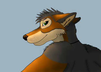
More practice with SAI. I think the highlighting is a bit off in this one. Shading/highlighting continue to be a struggle for me. Also the first time I've successfully drawn a cat! Critique welcomed.
Sage belongs to Rory
Art belongs to me.
Submission Information
- Views:
- 331
- Comments:
- 2
- Favorites:
- 2
- Rating:
- General
- Category:
- Visual / Digital
Comments
-

-

Thank you so much for the critique! I'm all right with the way the lineart came out (you should have seen the first four attempts - they did look canine), though I do nitpick it the more I look at it. You are correct though, I didn't really have too much of a reference aside from a few photos of tigers. I'm trying to move away from my old charcoal realism and get more into cartoony/animated. I'm also trying not to use references as I used to only be able to draw something if I had a photograph right in front of me. For reference, here's a pencil piece I did a few years ago with a photograph reference: http://www.furaffinity.net/view/11026294/
I'm semi-colourblind (not red/green, but more non-contrasting colours look the same to me), so I think I overexaggerate shading/highlighting to make up for it. The lack of 3D knowledge I do think plays into it, especially if I don't have a reference. I'm going to go back to drawing a realistic piece in addition to the more animated/cartoony ones to see if that can help my eye for what the figure should actually look like. That and studying more photos to get a better idea of how things look instead of symbols. :) Thanks again for the response!
-
Link
asterionblazing
First off, good on you for drawing a tiger that has big cat features. I see a lot of sticking dog muzzles on animals that aren't actual dogs because it's easy/the artist hasn't actually bothered to see what the animal they're trying to draw looks like, and I'm glad to see that isn't the case here.
Judging by the drawing, it seems like you might be more relying more on symbols or the idea of what something looks like, versus observing what it actually looks like and trying to translate it into your drawing. The shape of Sage's muzzle and head are such where I can believe you referenced a photo of a tiger while drawing it, but other things such as the almond-shaped eyes, triangle nose and Disney lion ears suggest that they were drawn more according to what you think eyes, etc. look like, as opposed to what they actually look like.
You mention shading/highlighting are a struggle for you, and I think it's due to a general lack of understanding of how to think in 3D with 2D forms has a lot to do with it. Looking at your Diego piece, you're shading according to contour (that is, your lines and edges) and not according to form. As a result, the figures appear flat even though they're twisting and turning in space. I think it's worth mentioning though, that a good rendering won't fix a drawing that has issues. I would encourage you to draw more from life (or photographs) first to get away from drawing symbols before worrying about how to refine your renders.
There isn't much to go on in your gallery, but I do think you have some good things going on in your pieces and would encourage you to keep working at your basics. Things like a nice rendering will follow in time. Best of luck in your artistic endeavors!