Sign In
Close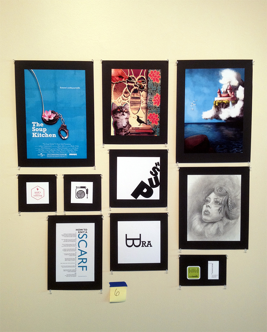
This was my portfolio for Sophomore Review.
Turns out, I made it into the program! Now I am officially a graphic design student.
From left to right:
Poster, photoshop collage, digital drawing,
Icons, word as image, traditional drawing,
Type dominant piece, word as image, business cards.
Submission Information
- Views:
- 292
- Comments:
- 8
- Favorites:
- 1
- Rating:
- General
- Category:
- Visual / Other
Comments
-

-

Photoshop is actually one of the last things you'd use for text. That's what InDesign and Illustrator are for. ;) In that case it would be Illustrator-y text magic haha. :> If you ever get a vector program, I can give you some pointers of how to use it.
-
I did take a brief graphic design class, and I did use illustrator for a bit... but I found myself always going back to photoshop :I Illustrator was too clean for my tasted, but I didn't get to experiment much
-
That's understandable. But if you're going to use text for anything, photoshop isn't the place to do it because of pixels.
-
-
-
-

These are lovely aaaa
the poster is super sick-
Thank you. v
-
-

HEY, CONGRATS ON GETTING IN TO THE GRAPHIC DESIGN PROGRAM. I know getting into art programs can be hard. The 4 year school I'll be transferring has an illustrator program that can be really hard to get into.
I love your typography, I mean, you work in general in this portfolio is great, but your typography really sticks out to me. The "Bra" one is really witty and creative, and I really enjoy the motion you put in 'Push," it's a fantastic reminder about what you can do with just words alone.
Keep up the great work my friend, and god speed in your endevours in the program :].
-
Thank you. Your appreciation flatters me. :>
-
Link
EmilyThePenguin
that's a snazzy lookin display c:
your castle piece turned out fantastic and the bra typography made me giggle. I'd be cool to do some photoshop-y text magic and make the B look like an actual bra or something