Sign In
Close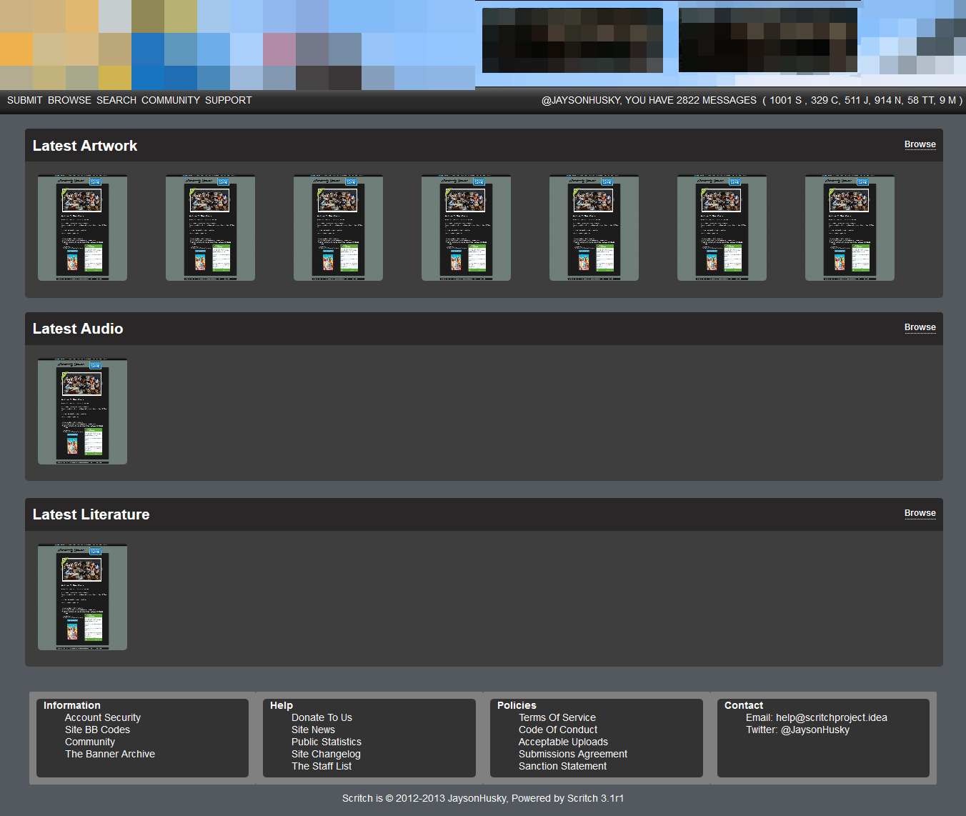
About this submission:
This is the Scritch homepage version 2.
It features a fully fluid design, able to scale down to 800x600 and up to 1920x1080 without issue. (800x600 users will only see one advert at the top!)
Expanding Art segments, each segment carries 7 submissions when at 1366x768 resolution and upto 21 when at 1920x1080.
Animations are directly incorporated into the Artwork segment, but can have a segment all there own if needed.
Browse buttons to take you to the latest submissions of only that specific type.
Clean UI with dropdown "Community" and "Support" menu's hiding all the needed links.
Efficient message center with dropdown menu for new journals, private message composure and links to editing profile information, blocklists etc.
NOTE: The footer navigations is NOT complete yet, but this submission will be revised with the finished version.
Comments & Critique:
I welcome all comments and critique on this submission, as I am always looking to enhance my skills and create better content for you.
Please refrain from abusive language and/or arguments within the comments section.
Disclaimer
This content is 100% my own, I have blurred the banner and adverts for the rights of the users, since I haven't obtained permission to display them fully.
The submissions to remove the need for permission are my own and therefore fall under my rights, (The initial submission you see in the image was given permission for upload by latinvixen and therefore constitures acceptance for upload. I do not place claim to any content created by LatinVixen, nor do I incur any financial benefit by including the submission within this submission.)
And Finally
Enjoy and let me know what you think. I really value your thoughts.
Submission Information
- Views:
- 286
- Comments:
- 6
- Favorites:
- 1
- Rating:
- General
- Category:
- Visual / Digital
Comments
-

-

Aw, thanks.
Do you think there is anything that can be changed to make it better?
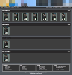
I'm thinking of adding a "Streaming Now" segment at the bottom to allow Streaming submissions to not interfere with normal ones.-
That would be cool ^^
Well. So far I'd suggest like a log in button. But since you've already logged in, I guess it;s gone past that part X3
-
I've added the Streaming Now segment to the design, which is now available at FA, (Here later)
Yes, The login button is there, but as you rightly said, I've already logged in. I made sure to add that part first. ;)
However I'm not infalliable, Dragoneer kindly picked me up on the point I missed out the "logout" button. *sheepishly turns away* I actually cannot believe I missed that one out.
-
-
-
Link
SethSholf
Really like the design. Clean and crisp lookin' ^^