Sign In
Close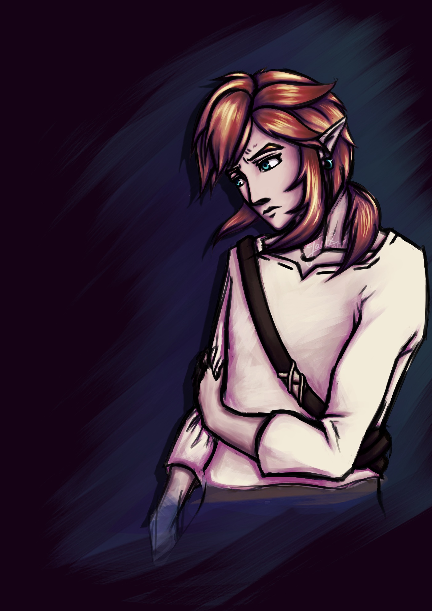


This one might actually look a bit better +o+
If you noticed this one has neater edges, that's because I found that those are a lot more noticeable in this version than in the other one. Plus if I'm going to enter this into the portraits competition, I might as well make it look smart B)
it'll still look lazy though lololollololoooolololol
I was also contemplating whether I should use a black background instead of the purple thingy it is now, but I found that it gave too much contrast, so yeah. That's that :P
Submission Information
- Views:
- 527
- Comments:
- 0
- Favorites:
- 0
- Rating:
- General
- Category:
- Visual / Digital