Sign In
Close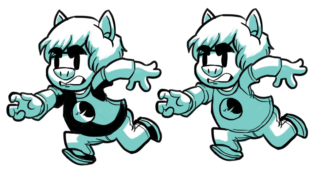

I'm getting ready to start heavy pre-production on my second graphic novel, and I'm trying to figure out how it should look. I want to run two graphic novels at the same time (to lessen the monotony of drawing the same four characters for an entire year.) but I don't think the four color dyed gray scale of my first graphic novel was that effective.
The other one is going to be black and white.
Submission Information
- Views:
- 373
- Comments:
- 1
- Favorites:
- 2
- Rating:
- General
- Category:
- Visual / Digital

Link
HeartStar
I like the pop! of the blacks on the left version, but they're both nice and clear on the eyes.