Sign In
Close
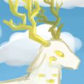

I spent a whole week on this thing and it feels like it... quite turn out so great? it feels like I messed it up somehow, and if you can help me figure out why I feel that, that would be great.
Either way I like white and gold colored things so doing more of them was pretty much a priority of mine
Submission Information
- Views:
- 300
- Comments:
- 3
- Favorites:
- 5
- Rating:
- General
- Category:
- Visual / Digital
Comments
-
-

hm, they ARE lacking shading, thanks for pointing it out.
usually I'm pretty loath to fix a thing once I'm "DONE" with it and given how long this took I'm really tired of it now so fixing it is not gonna happen, but maybe future pieces will be better
if you can explain the tip about shading them a bit though that would be cool
-
yeah i was just trying to see what you could improve on in the future, since the description said you felt it was messed up somehow. i think just more detail to the wings to make them look more like actual feathers would help. shading each of them individually and under the arm(??) bone of the wing
-
-
Link
sighs
this is pretty nice, i like when people come up with more creative angel designs. white and gold are kind of a staple! i guess the wings are lacking some shading and it could've used a background, like a stormy sky to keep the dark blue color it has now.