Sign In
Close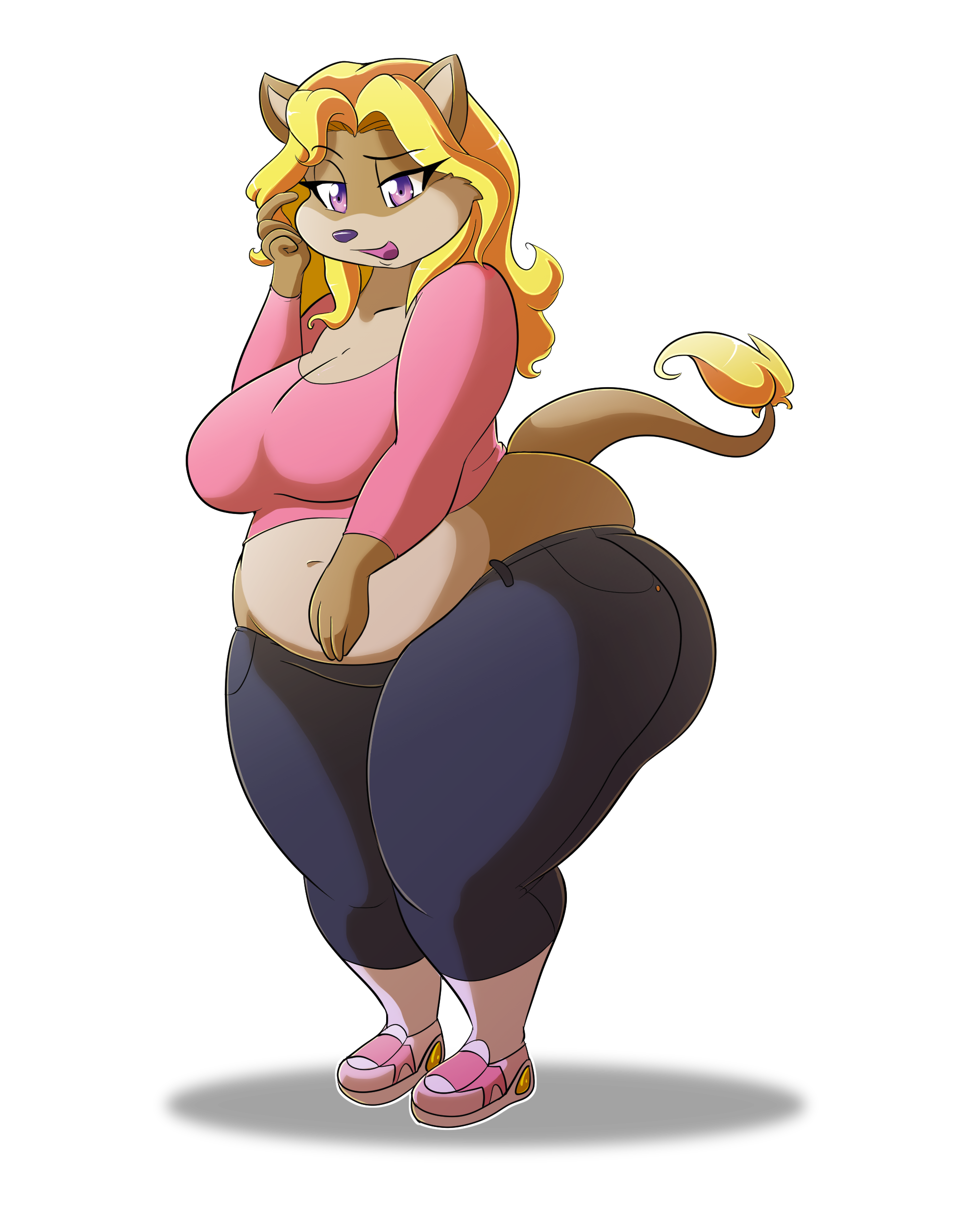

Trying to do more full colored drawings so I did some practice to keep my skills sharp and colored the chubby Lisa variant from here https://www.weasyl.com/submission/975941/lisa-variants I tried different gradients as well as line thickness and highlights, after a while I had to ask my brothers opinion but that was stupid cause from the outside perspective the differences are hardly noticeable.
ME:what about this layer, or what about this color gradient, what if I change this and add that?
MY BRO: dude it looks fine, none of them look any better then the others.
ME: Ugh your useless.
A critique would be helpful
Submission Information
- Views:
- 1363
- Comments:
- 0
- Favorites:
- 10
- Rating:
- General
- Category:
- Visual / Digital