Sign In
Close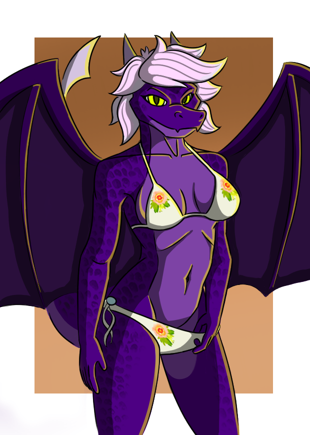
So there's a lot I want to say about this piece. But I'll split them into the Good's and Bad's.
Good's:
1. Used a different brush for line art. The same brush I used for shades in the past few pieces. And I think I like it better. Lines thin out near the ends now and I think it adds volume to my art. And it looks especially good for hair.
2. Used Reptile Texture in Krita, which adds decent looking scales without wasting a lot of time. Adds more detail to my art.
3. Liked the lighting and the background. Yellow on purple looks really good, and purple on orange too. I reduced the opacity of the yellow and it looked more orange-ish, and the background looks brownish because I added shade and light. Still works though.
Bad's:
1. I struggled a lot balancing the light and shades. I put too much yellow many times and had to erase it and start over. Especially had trouble with the hair. The lighting looks milder now, but I'm unsure whether I like it or not.
In conclusion, I think it came out pretty nicely, despite small flaws.
Reference: https://i.pinimg.com/originals/50/07/7c/50077c1276a22f81d25c8888b127e581.jpg
Submission Information
- Views:
- 577
- Comments:
- 0
- Favorites:
- 1
- Rating:
- General
- Category:
- Visual / Digital