Sign In
Close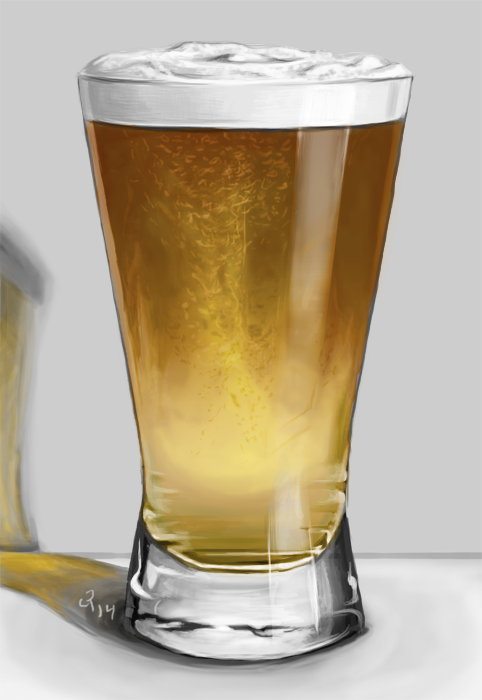

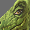
Theme was beer. Tried drawing beer. Was meant to be simply a warm-up, but decided to just finish it with how far I got in the hour.
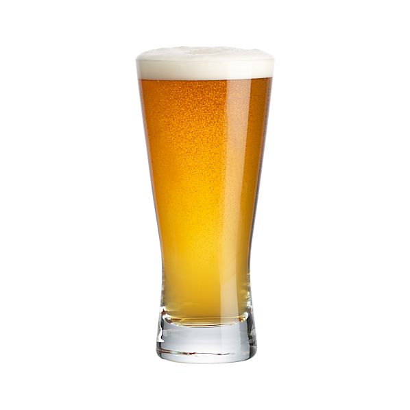
Started with this picture, expanded the references, tried to sit in on something instead of it floating in space. Then realized the base would probably look different if it were sitting on something. Oh well, I still like it.
Critiques welcome as always.
Music: TENACIOUS D - Kickapoo
Submission Information
- Views:
- 498
- Comments:
- 3
- Favorites:
- 4
- Rating:
- General
- Category:
- Visual / Digital
Comments
-
-
YYYUP on the whipped cream! You and many others have said the same thing! And I agree -- it's easily the weakest point of the image for me. And for the life of me, I could not get it to look like cream. I tried making it fuzzier, and tried less shading, but it just got messy or hard to read. Argh! More practice is needed. There must be something I'm missing.
Thanks!
-
It's the really dark shadows that do it. Because they're so prominent, they suggest a thicker substance that blocks more light. The shadows in the center there are the worst offenders.
If you think of all grays going on a scale between 1 and 9, where 1 is pure white and 9 is pure black, then the shadows on the foam are probably about a 4 to a 6, when in the reference photo they are really more of a 2. So the foam definitely needs shadowing, but it needs very LIGHT shadowing. Try that! I'd like to see the image again if this makes a difference.
-
-
Link
Ween
Before I saw the picture link I figured you must've done this from a live reference, and man that'd take some willpower, haha.
If I had to say anything, it'd be that the foam on top has too much shading going on with the little whips and peaks and valleys. Makes it look like whipped cream. I love the translucency of it all though.