Sign In
Close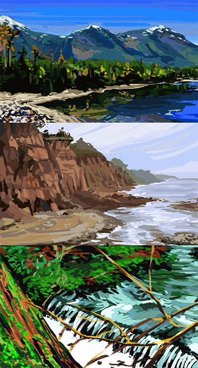
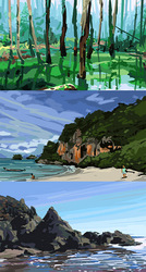
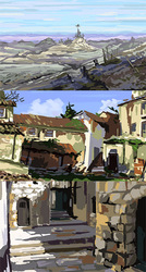
More photo-based colour studies. The behaviour of water never ceases to amaze me :0
Submission Information
- Views:
- 501
- Comments:
- 6
- Favorites:
- 7
- Rating:
- General
- Category:
- Visual / Digital
Comments
-

-

:3 ~
-
-

I'm not familiar with art on a professional level (though I'm doing my best to at least obtain a better grasp), but when you do a color study, how do you go about it? Do you approach it on a layer by layer basis per color, or is there a different method of madness? Your perspective is impeccable, I must say.
-
Usually with colour studies, at least for me, I want to replicate both the colours and values [light to dark] of whatever I am observing, in this case photographs. The goal isn't to copy the source in so much as it is to observe the subtle colour changes [like the various shades of blue in the sky or how 'green' forests actually tend to have a lot of other colours thrown in]. Colour studies also break my habit of drawing lines to denote shapes [mountains. trees, lakes etc.] and forces me to start understanding how the objects will emerge by themselves if you get the silhouette and colours right. In essence, it's a form of exercise for artists in which you focus heavily on trying to figure out what you actually see, as opposed to what you think is there. From every study I do, I emerge with a sense of surprise along with a new sliver of knowledge about the subject matter.
-
Mm, that's a great way to put it, thank you. I'll enjoy seeing the studies you post. Getting to see your process is really enlightening! I'll have to give this a shot sometime, because I like playing with color more than anything.
-
Definitely give it a shot :D! It will surprise you just how having a few right colours in the right area starts to elicit an image.
-
-
-
Link
taala
<3