Sign In
Close
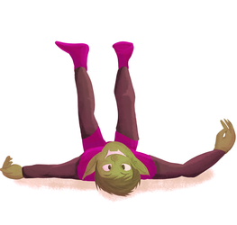
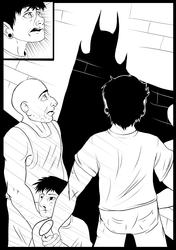
Working on my sequentials again.
I'm really, really proud of this so far because this little comic is pretty much targeting all of the areas I'm weak in.
Submission Information
- Views:
- 341
- Comments:
- 4
- Favorites:
- 1
- Rating:
- General
- Category:
- Visual / Digital
Comments
-

-

Thank you so much! Pacing was something that I was weak in when I drew my last comic so I've tried to keep the flow constant with this go. I was a little worried about how the characters blended in with the rest of the set but I didn't really know how to fix it. I'll definitely take your advice and start varying my line weights more. I really appreciate that you took the time to look this over for me.
-
-
I can't wait to see what you do next!
-
Thank you! I'm hoping the next comic I put up is going to be an original story, I've got some ideas that I'm messing with at the moment.
-
Link
kingcoyote
I think the paneling flows pretty well and it's fairly clear what's happening so far, which is super important. The characters kind of blend in with the background a little bit, though. Have you considered using a variance in line weights? For example: using a size 8 brush for outlines, and then doing the detail lines in a size 5 or 6 brush? Having a thicker outline on your characters would really make them pop.
Lookin good! Keep on comic-ing!