Sign In
Close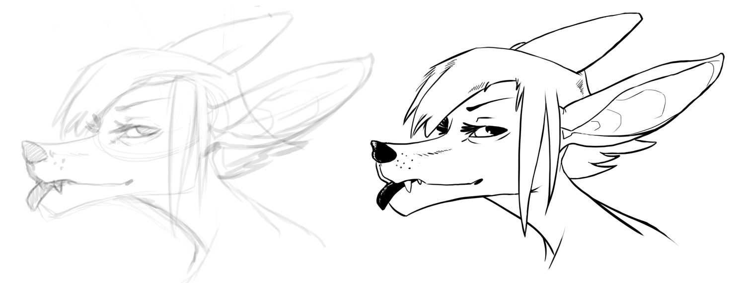
Lucieth provided the sketch. Critique wanted on inking only. Sketch is for reference.
Download for full view please.
I decided to be more gestural with the lineart and did it in quick strokes instead of meticulously lining. It did a decent job keeping the original life in the sketch. That ear man. It took a few more strokes than the rest to get it inked just right. I added a few little details here and there also that weren't present in the original sketch. Hopefully it's not too butchered! It was a step out of my comfort zone.
Submission Information
- Views:
- 583
- Comments:
- 8
- Favorites:
- 1
- Rating:
- General
- Category:
- Visual / Digital
Comments
-

-

I use an Intuos4 tablet. The settings in SAI are about 5 for both the stabilizer and pen pressure. I bumped it up to 10 to see if that makes a difference. And thanks for reminding me about the Tip Feel! I thought it was changed to the firm side of things due to my heavy-handedness but it wasn't. It must have reset itself in the past year. I tested it in SAI and wow. To make those lines thick takes effort now! I still have issues with making lines too thick when making circles though. One side will be fine but the other will be super thick. It doesn't happen so drastically with traditional inking, only with digital inking. Not sure if there's another setting to help fix that little issue other than drawing slower.
This one will be redone with the new settings and hope the tablet doesn't reset itself in the middle of inking. Maybe those thinner, delicate lines will happen easier for the areas they need to be in.
-
Yeah, the Sai Stabilizer settings are worth turning way up as well (Though that S-7 setting is crazy). That makes incredibly smooth lines that are easy to control at the cost of some speed perhaps. I can't sketch with Sai anymore so I rarely use it. I think I got too used to controlling my lines in photoshop. So much about Sai I can't get used to now.
It's truthfully a preference matter.
-
Yeah I used to get into those crazy slow smooth lines back when first messing with the program. Truth is, I hate drawing lines that look too much like vector work without using actual vectors. Some "organic" flow is nice. Of course turning it way up for more mechanical objects could be beneficial. I got a crazy one next dealing with space ships and mecha to test it on. X)
Pfff, SAI has spoiled me so much that Photoshop lines are crap to me now. I can't even sketch in Photoshop since my computer doesn't support Open GL to use canvas rotation in CS4. Yet this old laptop lets me use the canvas rotation in SAI...
-
-
-
-

That's pretty good. Tis smooth and nice to look at. Just that ear screwed up that smoothness. But got a nice technique going on.
-

Long quick strokes is always the way to go, wooh! Now practice this in forever!
It's pretty good, but as Lucieth mentions, it could be even better as a standalone lineart if you did some lineweight.
There's a few different ways to do this so it feels right. Perspective is one of them, meaning things in the front should have thicker outline than things in the background.
It would hardly apply here though, as it's just a head X)
In this case I would probably focus more on light and shadow. Making the lines thicker where there's more shadow.
Also, I like to make lines inside the character really thin and fine, compared to the lines at the edges. If that makes any sense?
But that is just a personal thing. There's so, so many different ways to do linearts it's crazy, and wonderful!
Link
Lucieth
Looks good, though. The ears can be a real' bitch to ink, but I actually added her in because I thought that would be an okay subject for trying out new ink'ing techniques.
I'm interested in what type of tablet you use? When doing ink'ing in Sai or photoshop changing the pressure needed for strokes can be extremely useful. On the Wacoms it's called Tip Feel. Turn it towards Firm to minimize too much uncontrolled line fluctuation. Paint tool sai also has the Stabilizer option that's extremely useful in the top bar, I have mine around 10. But yeah, higher numbers means even slower more controlled pen strokes with the Stabilizer option. I usually turn it down so it doesn't interfere with the flow of my lines but still do okay in terms of clean lines.
I'm sorry in case you knew all of that. I realize it's not easy to ink someone else's work, especially when I didn't make it too easy for you. I do however have a bit more advice to keeping the sketch dynamic and alive when ink'ing. I notice that below her chin all the way to the neck/throat, that line is quite thin and delicate on the sketch. The same with the bottom of the ear facing us, where it over-laps with the inner ear, is also rather thick on the inked one. The back of her hair too, a bit too thick for hair that is behind the ear ( from the viewers angle anyway). I think that ways of pushing the inks flow is by perhaps reducing some of the thickness in places that has nothing behind it and otherwise show the line-weight where the material seems thicker. Or where "perspective" requires it. This close we wouldn't actually see atmospheric perspective but we can fake it some to create some flow.
I used to be big on the whole ink'ing thing. And I kind of miss it sometimes. I might do some inks in case I actually get around to do some proper sketches.
I hope I'm not rambling too much. It's 10 hours since I should have been to bed and my brain is silly