Sign In
Close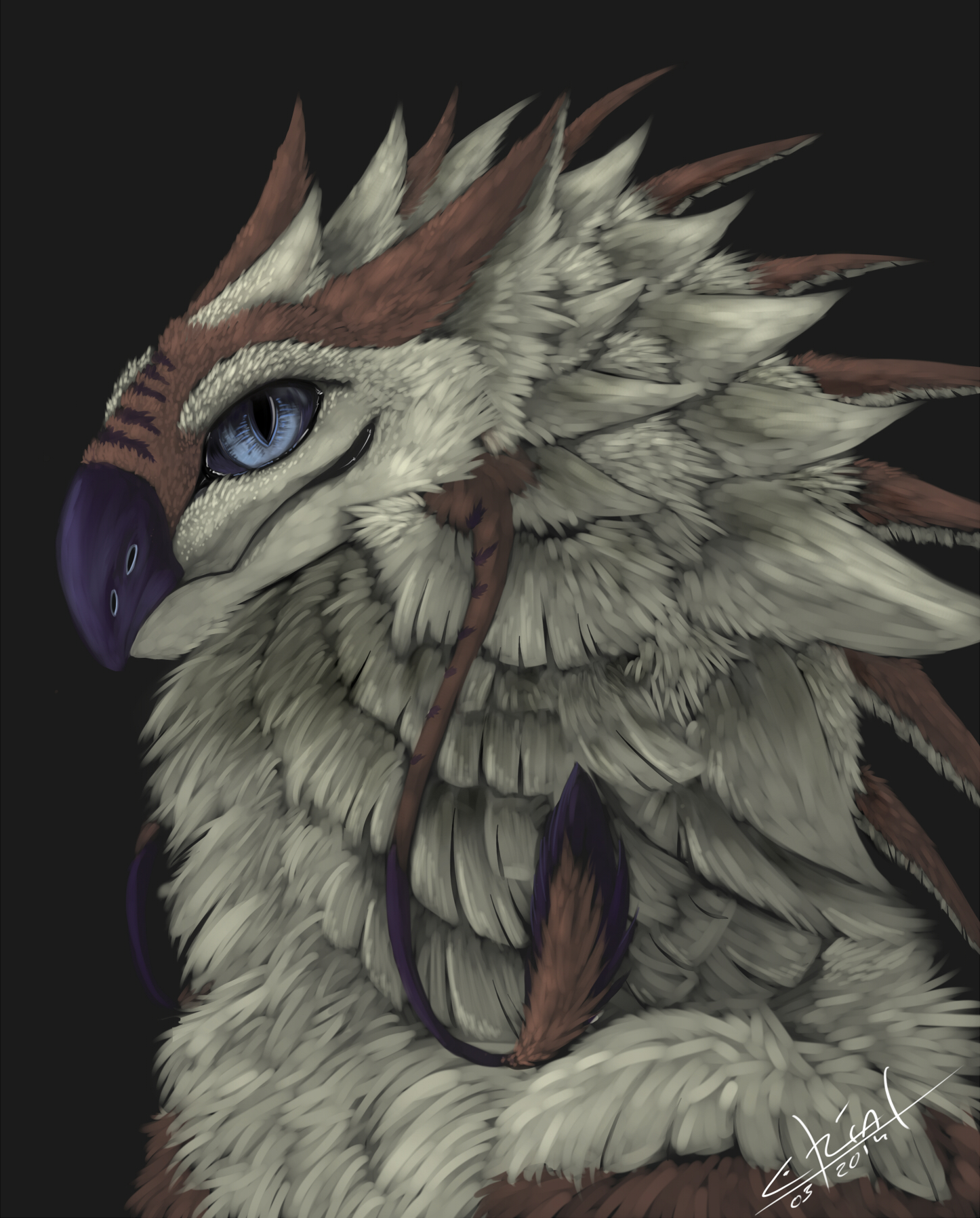

This is one of the experiments I was talking about in my Journal.
I do believe it came out quite well. And a necessary topic inbetween working on the open comissions I have, to deliver you something better even.
So here I present Quinn to you, I bought his basic design from mangaryang because I saw something in him, now I have changed his design a bit and I think its not final, but a very good way to what i see in him. (changes are permitted)
The name Quinn is of Irish and Gaelic origin and means "counsel" or "intelligence", "wise" or "knowledgeable".
Tough I chose the name first, and searched for its meaning afterwards, I do believe it fits him quite well.
He would be another extension of myself, just like my Var'rasheris species~ a symbol for specific traits i inherit.
Caura species © belongs to mangaryang from Furaffinity
Quinn and Art © belongs to me
Submission Information
- Views:
- 404
- Comments:
- 5
- Favorites:
- 7
- Rating:
- General
- Category:
- Visual / Digital
Comments
-

-

Thank you kindly :3
-
-

There is some absolutely great colouring and layering work done on this, and it's clear that you've put mad amounts of effort into this. The texture shifts are really well-done, and I like those little details (the tiny little specks of feathers you have on top of his head and around his eye, for example) that you've put in.
The dude seems like he'd be fluffy as all get-out. I'm not sure if you really nailed the texture of the bigger feathers along his neck, though. They stand out from the fur, but I guess they don't look totally "feathery" to me. But from what I've been told feathers are damned hard to draw.
It might be the way they reflect light, compared to the fur. You did a good job with the small bits of flesh we do see, it's not like everything has the same reflective properties. :) Maybe use an even thinner brush when you're filling them in? The way they end uniformly and "split" still looks good.
Love to see more of this guy, though. And Quinn is a good name!
Hope at least some of the above helped. :D
-
Thanks a lot for taking the time to critique my painting!
I am very glad you see the effort and admire the detail I put in there.I am not sure about the neckfeathers too~ I want them to be furcovered actually, while keeping the soft flexibility- I think they look quite indescisive because i was indescisive too x3
You are right tough they need work, thats my exact same view on it.I will also look into the reflective properties of flesh, you are right. I am satisfacted with the eye, but i believe too, that his lip could use some more love.
Thanks again fo the kind words and ideas, I appreciate them very much!
-
-

wow <3
Link
Skatmat
That eye is mezmerising, well done!