Sign In
Close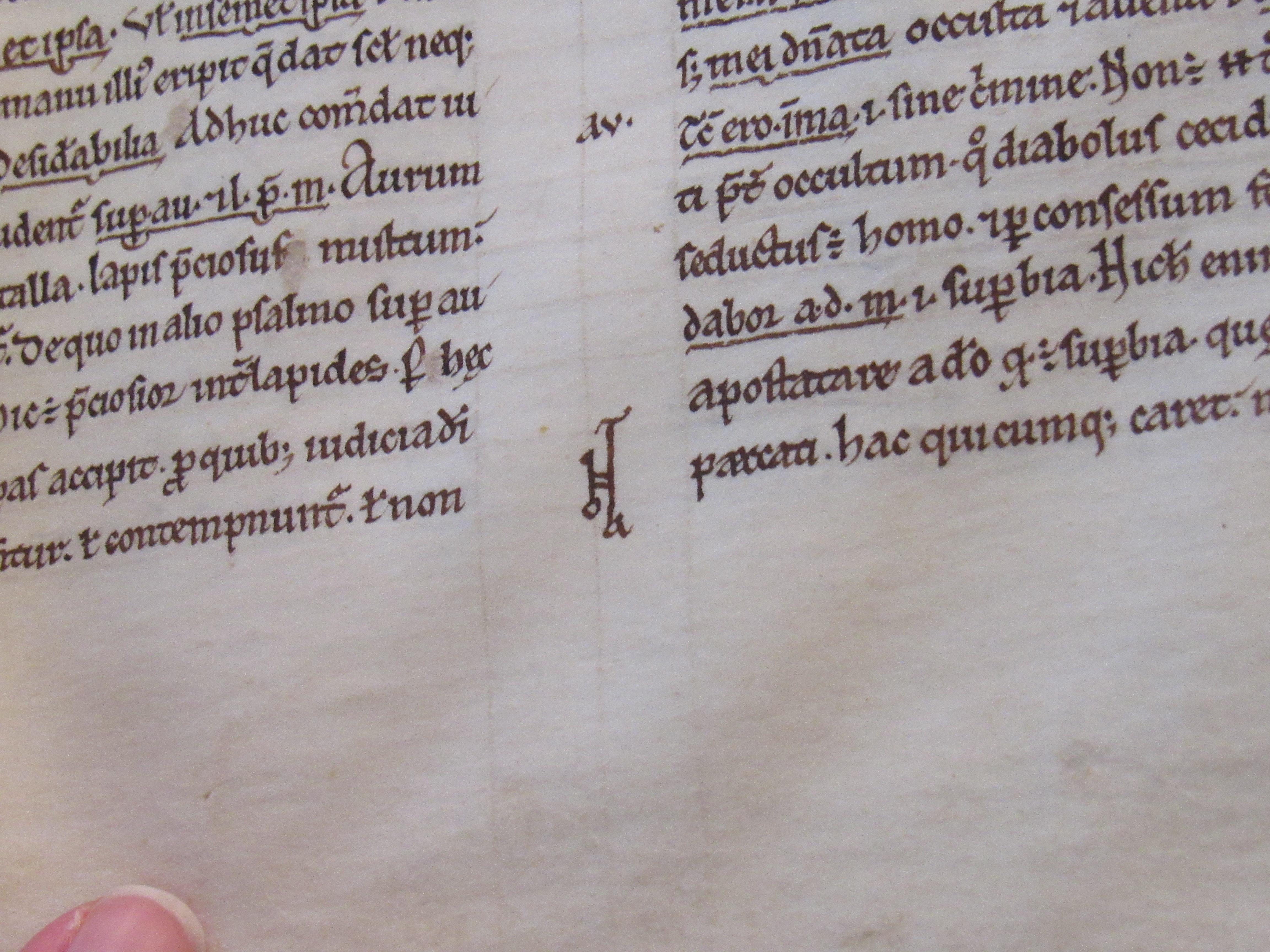


Here is an interesting feature. The design at the lower part between the two columns is a stylized rendering of the word "NOTA" meaning "Note." The span from the top of the "T" to the bottom of the "A" designates the part of the text to be made note of. These appear several times throughout the text but this is the clearest example by far.
Submission Information
- Views:
- 673
- Comments:
- 2
- Favorites:
- 1
- Rating:
- General
- Category:
- Visual / Photography
Comments
-

-

It transcends solidly into the realm of art when you consider the illuminations and capitals. There's little doubt that the scribes of the day were both artist and artisan and even though their names aren't plastered all over the books they copied, they clearly had some pride in what they did.
-
Link
Tonin
It's fascinating all the little flourishes that get added to things when they're still in that realm of quasi-art rather than pure communication. I was trying to think where anything like this gets done nowadays, and corporate logos were about the only thing that came to mind.