Sign In
Close
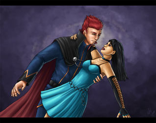
An old art trade for someone on Fanart Central awhile back. It's pretty simple, and kinda quickly done, but I was pretty satisfied with it, just 'cause I've always found it a challenge drawing two people closely interacting. So this is her character, Victoria, and Bankotsu from... um... I forget which anime. Shows you how much I pay attention, haha.
Drawn August, 2011
Submission Information
- Views:
- 500
- Comments:
- 6
- Favorites:
- 0
- Rating:
- General
- Category:
- Visual / Digital
Comments
-

-

Ah, thank you for the comment. This one was done quite some time ago, and was an art trade with someone who never held up their end, so I'll admit, I sort of rushed through it. ^^; Thank you for taking the time to comment and offer a few pointers. :3 I agree about his eye. I always did find it kinda weird. You know, after it was too late to fix it, lol.
-
-

Hello, this is mostly a nice piece. Along with what the other person has pointed out. I think you should also study how cloth folds. http://www.mightyartdemos.com/mightyartdemos-bradley.html
By studying those folds you're also going to have more knowledge of where the lighting will fall.
In addition, the female's hand is a bit flat/incorrect. Where there should be palm padding between the thumb and first finger. It looks to be the thumb is a little too low.
As far as the eyes mentioned, not only are they too close, but they don't seem to wrap around the head.
Nice colors and couple pictures are a toughie to pull off at first, keep going!
-
Thank you for taking the time to comment. :) Again, this picture was drawn two years ago and done very quickly.
-
Please note the reason I commented is that you have it flagged for Marked for Critique. That means anyone will see this piece on the front page and likely give a critique.
-
And I appreciate that. Thank you again for taking the time to give me a thought-out critique. It's so much more meaningful than comments like "Nice" or "I like this."
-
-
-
Link
Algorithmus
I think the anatomy is mostly okay except for a few details like the eyes (I personally find they're a bit too close together and his left eye looks like it's doing something funny). However, I think the real issue here is the lighting. It looks flat in a few places. The shading depth and light direction seems fine though; you don't really need to use too many more darker colors (If you're really keen on it though, I would suggest adding it sparingly to a few areas, but very subtly.) If you look at her shoulder for example, it looks like there's not much depth. It's not because it's not dark enough though; it's just not sharp enough.
Judging by the strokes you're using, it would probably help if you started with a more general broad global lighting over the entire piece and then doing the details last, as it will save you time and effort in shading stuff that doesn't need to be shaded as heavily.