Sign In
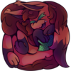
Close![[CE] Chimes of Midnight](https://cdn.weasyl.com/~sumiink/submissions/1668986/9558072cba83f8918d7565cbfc3d7847962056558740276e81dc438fc134e704/sumiink-ce-chimes-of-midnight.png)
I had no idea when or should this be posted. Since the contest is officially over, now would be the time if any. I didn't have much of an idea on how to handle this, so I opted to not post a version with the required border and logo.
The audiobook I chose for the entry was Chimes of Midnight, a murder mystery crossed with a time loop. It has a great twist, and I really recommend it.
For the drawing itself, I think it's the largest one I ever did. Literally. It definitely made adding smaller details, like the watch chain, easier, but I'll likely need to wait to do frequent larger scale drawings as FireAlpaca almost crashed while saving it for the last time. This is likely my computer more than anything. I used warmer colors for the foreground shading and it becomes cooler as it goes on. (also why there's so many layers as it used a flat color then a clipping layer with a warm to cool gradient.)
Time Taken: More than 8 hours
Total Layers: Over 50
Submission Information
- Views:
- 507
- Comments:
- 3
- Favorites:
- 2
- Rating:
- General
- Category:
- Visual / Digital
Comments
-
-
Thank you so much for the critique and don't worry as it didn't come off as weird. I hope you're alright with a ramble inbound since that kinda happened.
The proportions and hands are completely understandable to me. I can sum up proportions as a slow to climb slope. My proportions are getting better to my knowledge but not very quickly. I'm sure it'll continue to improve with time and I could probably speed it up if I wanted to. For the hands, the mitten look has been my go to if the fingers are together (each digit is drawn if it's separate, which usually have some kind of reference use). It's likely rooted with my use of small canvases and comics also with smaller canvases. It tended to make the hand a black blob thus the mitten workaround. I definitely want to try to deviate from that, though.
I honestly have no clear idea of what to do with clothing. So far it's been a balancing act of having folds but not making it too detailed to where it's the focus. Really need to iron that out a bit. So far it's just the key spots, like joints.-
Either way it's a very nice piece! And I quite enjoy your art so Imma just click the follow button.
-
-
Link
sinisternoodles
Your art is super cute! I love the shading too!
It says critique requested so here are my thoughts: I think your main weakness is the anatomy, and hands. Don't get me wrong hands can be pretty tough to learn! And the wrinkles on the shirt seem a little out of place in a way. Maybe look up some tutorials on it there are some pretty good ones out there. I'm not that great at critique so sorry if I sound a bit weird. 😅
Just keep practicing, and drawing! Your art is really nice and cute and I know you'll do great in the future!