Sign In
Close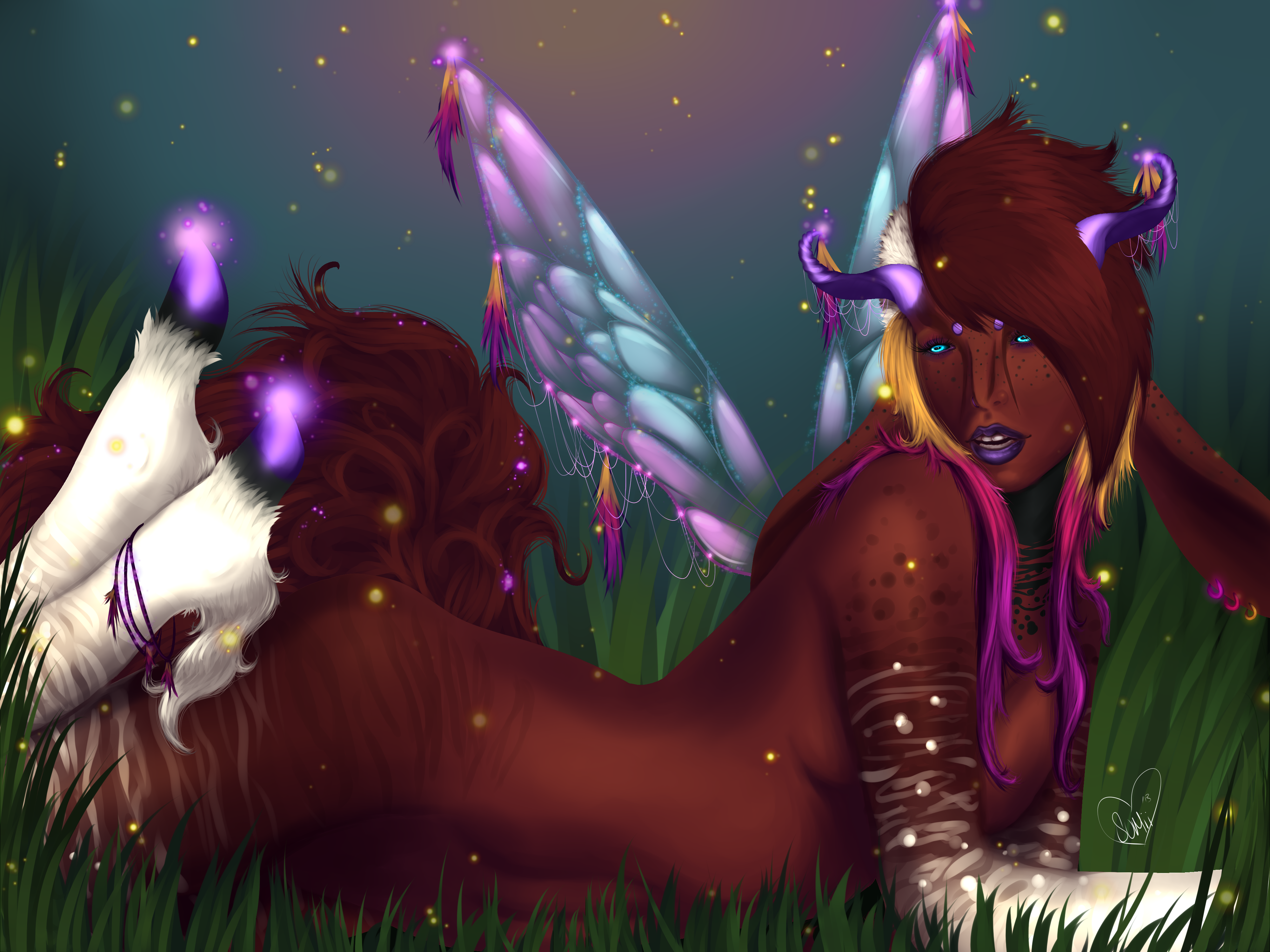
Just uploading stuff to fill my gallery for now.
Art@Me
Submission Information
- Views:
- 359
- Comments:
- 4
- Favorites:
- 2
- Rating:
- General
- Category:
- Visual / Digital
Comments
-

-

Thank you!
-
-

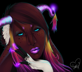
Hello. I like the uniqueness of the design. I wanted to note a few things. The proportions on the face are a bit off. The eyes are small for the head and nose too long for the face. One good site to learn proportions is Stan Prokopenko's site http://www.proko.com/
The other thing is that the image is a bit busy and hard to figure out there are a few ways to combat it which is squinting and stepping far back from the image. The other is color theory of course. The third helps when you learn how to use edges. It's good to allow some things to be less focused or saturated so you can focus on the right areas.
Perhaps this site can help you in the right direction as well http://rightbrainrockstar.com/art-instruction/basic-drawing-skills-perception-edges/
Keep going!
-
I actually used a reference for her face and pose.. The sketch proportions looked great I think.. I noticed after finishing the colours that the eyes looked rather small. However, I think I like her having a long nose merely because it makes her look more "Alien" and I think it makes her face in general look elongated much like the animal her markings were based off of, an Okapi. But.. I'm weird when it comes to noses >_> I always like them to look strange and out of place. (Crooked and large noses are the best ^_^) I agree that the image is very busy. I struggle with making my backgrounds look nice without distracting from the focus points. I will check out these links, thank you very much<3
-
Link
PineRain
Nice design!