Sign In
Close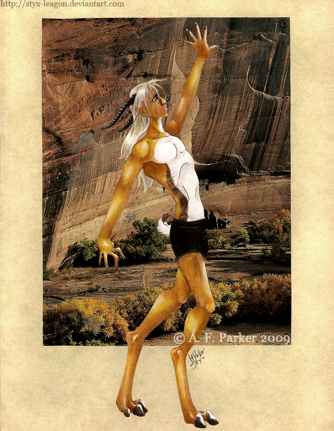
Yeah, no creative title because I’ve just run out it seems. My character Hershel from a novel. He’s part gazelle in case it wasn’t obvious enough. I clipped the background out of magazine, but I’ve forgotten what that magazine was.
Lineart was pretty old, but I liked it so I finished it. I am especially fond of Hershel's feet. His body is elongated and his limbs exaggerated to further distinguish his gazelle characteristics.
Artwork, character, and design © A. F. Parker (Styx) 2009
Do not copy, alter, or distribute.
Submission Information
- Views:
- 250
- Comments:
- 2
- Favorites:
- 0
- Rating:
- General
- Category:
- Visual / Traditional
Comments
-

-

Thank you.
-
Link
ShadraAvro
You have a nice grasp of shading, lighting, and how to twist anatomy to the character. However, I think there are a few issues within the image. The background image is nice but it takes away from the character a bit in that you can see the light source comes from the right side of the image where his hand is outstretched.
This clashes with the lighting on his body because it seems to come from both sides. Also because he exists outside of the space of the image, he seems grounded within it for most of his body except his lower legs. This creates a spacial problem, and as a viewer it makes the layering difficult. You could solve this by perhaps having him extend past the image in multiple points.
And a few more trivial suggestions: You may also want to reconsider the location (or maybe colour/opacity) of your signature. The white copyright mark and name over his leg flattens it. On another note, since he does stand in front of the image, perhaps you could give his feet a little bit of shadowing (use a cool colour) so he is grounded more.
Hope all of this was kind of helpful. ^^; Did my best to critique. It is in truth a lovely image and you did very well. I love your colouring.