Sign In
Close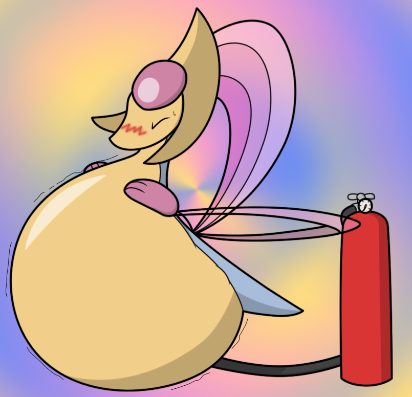

Originally posted on FA on 26 Jan, 2014
Looking pretty tight there, isn't she? It seems that she's been caught up enjoying herself too much to realize that she's at her limit - I'll leave it up to you how that turns out, but I will say that it sure doesn't look like she's going to be stopping any time soon, and she doesn't have much of any give left.
A relatively quick work. For how obsessed I am with strain and popping, I sure haven't done any of it. This was drawn as an exercise of sorts - I'm trying to get a character to actually look full, and something about Cresselia's body shape made that seem relatively easy, so I went with her instead of some anthro that would take forever to pose and draw. I don't really intend to draw much Pokémon stuff, though. The focus on looking full is my excuse for being too lazy with the hose to even decide where it's going into her, so have fun with your imagination there, I suppose.
I'm somewhat satisfied with the expression. The sweat drop was a decent touch, I feel, and something about the harsh blush amuses me. Had it not looked so bloody weird on Cresselia, I would have tried out clenched teeth, but the eye squeezed shut and other such things made up for it, I suppose. I've come to realize just how important a character's expression can be for making them seem as if they're at their limit, as there will be plenty of straining, trying to hold it all in, trying to simply cope with the pressure inside of them, what have you. My point is that being lazy with expressions isn't an option for what I'm trying to do.
The belly itself, however, might need some more work. I think the highlight is a step in the right direction, showing that the character has been stretched taut akin to a balloon, but that alone doesn't seem to be enough to make them seem on the verge of bursting. It wouldn't be a bad idea for me to simply try out making the characters bigger in terms of how much they're filled, as I've ended up surprising myself with how little I actually inflate characters a number of times (this instance included), but there's more to 'fullness' than size alone. I tried out incorporating a few simple 'stretch lines' at one point, but wasn't able to make them look as if they had any reason to be there, so they were eventually gotten rid of. The lines on the outside of her belly seem to have only had moderate success, not looking out of place but still not making her look like she'd bust if you went so far as to poke her the wrong way. Admittedly, I'm kind of stumped at this point.
Any suggestions as to how I should attempt to go about what I'm trying to portray would be appreciated. If I can get this down, I can finally move on to some nice and taut less-SFW inflation that I've been wanting to do for so long.
Submission Information
- Views:
- 2562
- Comments:
- 0
- Favorites:
- 9
- Rating:
- General
- Category:
- Visual / Digital