Sign In
Close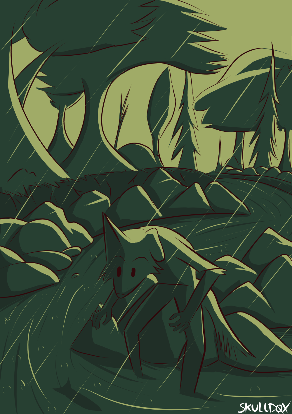

So when I started this art piece I wanted to try my hand again at making something like a previous style I had. However the colors for the previous version just didn't seem to have the same impact. I finally understand what I need to do to give it this beautiful but somewhat surreal color scheme. It's all about light values. I start with a shadow color (green) and highlight stuff with a strong, contrasting light (yellow). Then add a bit more shadow for the darkest parts of the same color of the shadow. So three colors. I might add more in the future but I worry about overloading it with too many details.
Expect more of this kind of "style" for most of my basic art stuff from here on out. It's something I actually like doing a lot.
Submission Information
- Views:
- 101
- Comments:
- 0
- Favorites:
- 2
- Rating:
- General
- Category:
- Visual / Digital