Sign In
Close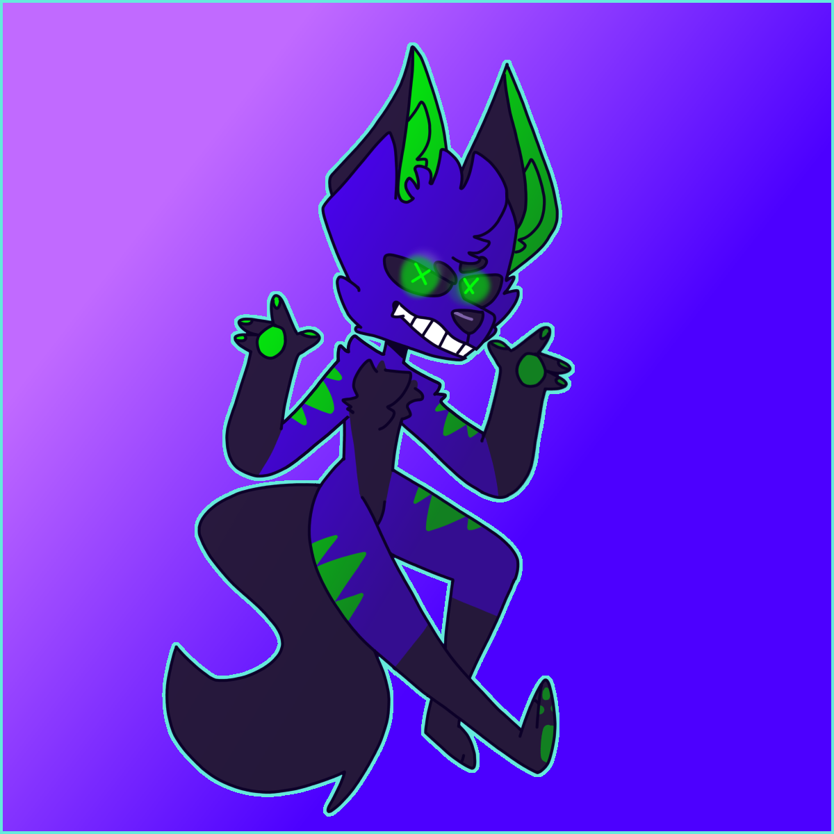
So I was just laying in my bed today just trying to rethink my life. Then I realized something about how myself, I am so chaotic! My life is so discordinated. I guess this is kinda of a vent because I'm so disorganized, I can pretty much ruin someones life if I wanted to.
Okay so you guys always leave really nice comments but I really need some critique because I know there are something wrong with this I just can't find it.
Submission Information
- Views:
- 527
- Comments:
- 36
- Favorites:
- 4
- Rating:
- General
- Category:
- Visual / Digital
Comments
-
-
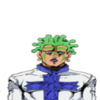
Hmm...Yeah, the elbows are a bit off. Thank you!
-
-
on a side note this is an eternal mood
-
Same as imax I also can’t find anything wrong with this. The fingers on the hands look a little weird but that’s probably just me. Other than that I think this looks pretty good. I guess the background could be developed better than just some colors, but that’s pretty hypocritical coming from me.
-

I do like this Piece. The colors are very eye catching and the design is lovely. Overall I like the pose.
As for critique something about the foreground leg seems off.
Almost as if it's to straight out? Seems almost uncomfortable.
Maybe making it bend a bit where the knee would be would look more natural.
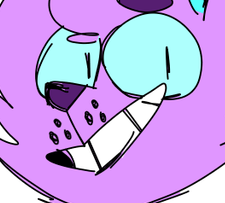
https://i.pinimg.com/originals/dd/00/22/dd00225211abe88f9936229391a21b89.jpg
I provided a ref I found on google above of just legs if it helps.
Again overall a great piece. I love your line work.
Keep up the excellent work! -

I don't really find any thing wrong either but what you should do is do a background that's Chaotic
-
yea that makes sense
-
-
Lol or probably Chaos emeralds 🤣
-
???
-
U know those chaos emeralds are what robotnik steals
-
-
-

I really like the piece as a whole and as a concept, the only things that I really notice is the upper arm is a bit too thin in comparison to the lower arm, that and the ear closest to the viewer isnt fully in the right spot or angled right. its a bit too high and facing forward as if its almost in a profile angle rather than 3/4s. Other than that its a really cool piece, I really like how you drew the legs in this one, its a fun stylized approach that really works for you.
-
Thank you! Yeah, perspective is something I really need to work on.
-
-
I feel a higher contrast between the eyes and the glowing colors would help them pop. It's almost hard to see what's glowing exactly. Maybe either dimming the glow to make the pupils stand out, or have a slightly different shade.
As for background suggestions, maybe 'chaotic' patterns and symbols (think movement lines or lightning bolts or what ever comes to mind when you think of chaos)? As it is, I don't feel any chaos from the image. Maybe a sort of exasperated energy (which is probably what you were going for anyway), with the shrugging pose, but it's pretty clean and orderly .
Otherwise, it's a very pleasing image to look at! The contrasting colors are nice and the character has a nice use of shapes. While not 'chaotic', the image has obvious personality
-
Thank you! And this is very agreeable I'm still need to learn more background stuff to fit the picture. But what saying makes perfect sense!
-
-

honestly, this is very good! the colors work well together and the anatomy is accurate. the only thing that seems odd to me is how the light in his eyes are done. it looks too solid to me, and could be blended more like the shading. aside from that, the picture’s great!
-
Thank you! Yeah I was thinking it could be blurred or something.
-
-

Are you ready for me to go straight to weaknesses that can be improved on?
-
Yup!!
-
The most painstakingly obvious weakness is in the ears.
The ear on the right is fine. The ear on the left is inside the middle of the head; the hair is the center of the head. The ear on the left is oddly appearing behind and slightly on top of the character, rather than in front of the hair and on the opposite side of the ear on the right; the ear on the right is on the side of the head. The ear on the left is facing right instead of left.
Odd shading in hands, eyes, and ears.
The green on the hand on the left is excessively bright (same brightness as the glow while other hand is darker). Left ear is different brightness from right ear. Left eye and right eye are a different brightness.
Would be a useful format for showcasing stickers.
The contrast from the pleasant background, flat shaded cartoon style character, colored border lines, and fully visible body pose make this an ideal format for showcasing single characters and objects.
-
Thank you!! This was really helpful!!
-
-
-
Link
Max Dimo
hmm.. i cant find anything particularly wrong with it, the only thing i notice is the width of the elbows compared to the rest of the arm
everything else looks pretty well proportioned to me