Sign In
Close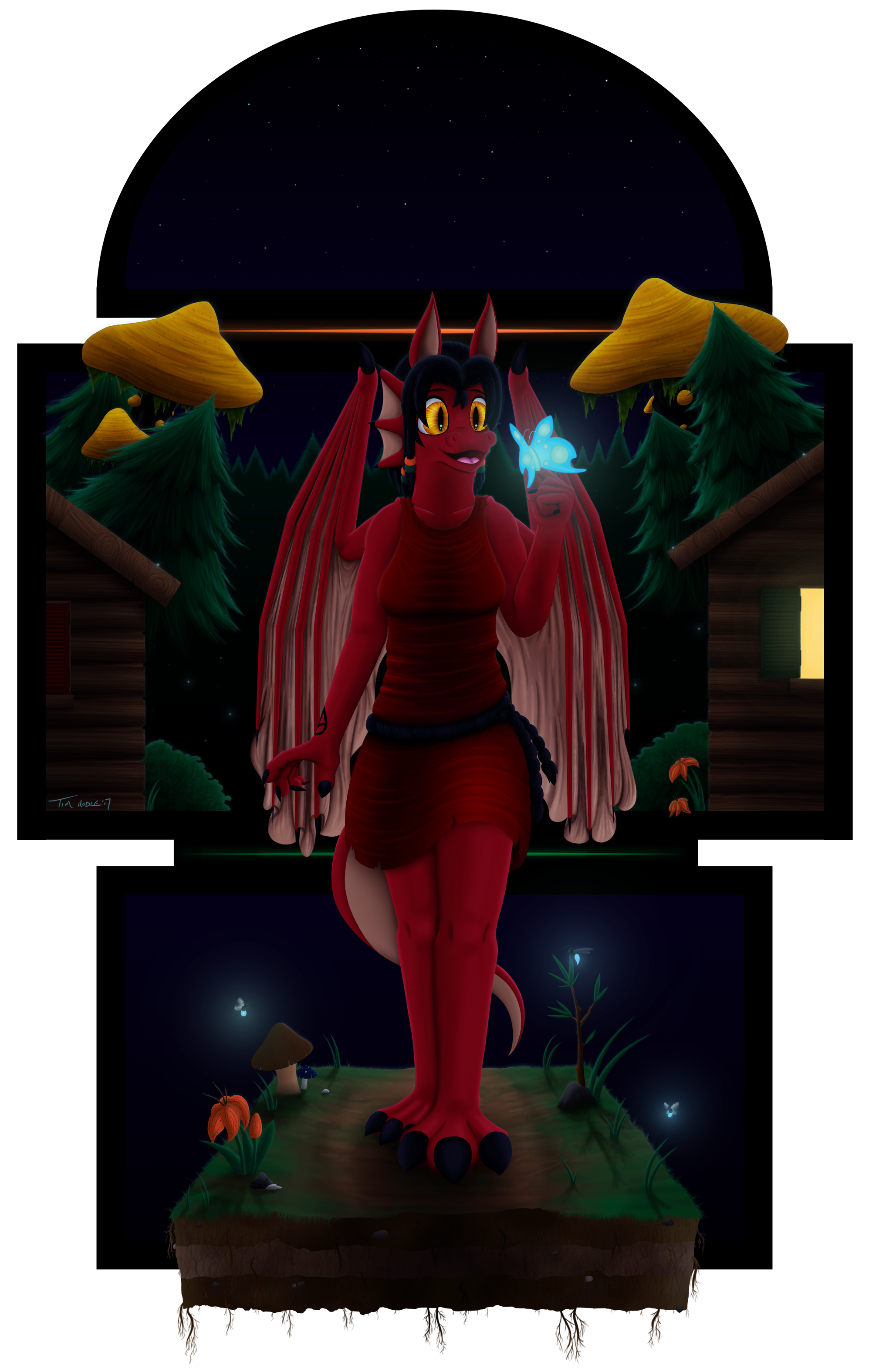

A.K.A. "I bite off more than I could chew."
Why is it that whenever I draw this character, the project always turns out be a nightmare to do? I don't know... I just don't know...
I went almost all-out with this one and experimented like crazy, particularly with the lighting. Firstly, I opted for a night scene since not only was that something I didn't do very often (or at least not very well, anyway), but it would be an ideal opportunity to experiment with both lighting and shadows. A lot of blues, both bright and dark, were applied, though the glow from the window helps to provide some additional contrast. I also added some bio-luminescent insects to add even more contrast to the otherwise dark image. That moth in particular (which I've taken to calling the "Moondust Moth") was a golden chance to also show some of it's vibrant light reflecting off of Sharon's face. Making Sharon's eyes stand out was also a priority; not only to provide additional contrast, but also for lore purposes. When I redesigned her, I wanted to establish that her eyes especially stood out in the darkness - not quite glowing, but definitely sticking out. I think I may have been able to do more, in hindsight, but it does the job adequately.
The background is a continuation of my "character in a block" setup that I messed around with in my last drawing, though with more blocks and, obviously, a proper background! Yeah, remember when I used to do those? Me, neither. It was admittedly an interesting experiment, especially the ground Sharon's walking on - why constrain that to the borders of the block when you can instead just draw a floating block of dirt? Complete with it's own flora and fauna, no less! This constrained background was definitely me experimenting and not at all an attempt at weaseling my way out of drawing a full-sized background! But honestly, I have taken a liking to this "less is more" approach regarding backgrounds, though time will tell if I stick to it. Not sure how I feel about the orange and green neon "stripes," though... those were an afterthought to provide additional contrast, but I wonder if they stick out too much? Let me know.
I am also aware that Sharon's pose is a little... static. I did have a slightly more exciting pose in mind (she was originally going to be holding a lantern and the moth was going to be hovering above her palm rather than sitting on her finger), but... eh, t-that didn't really work out. I know, I need to work on my poses more. Give me a break, I'm still trying to get back into things. I'll get the hang of things in time... hopefully...
...
Good lord, this project was an absolute nightmare. As the drawing progressed, I found myself dreading each new stage knowing it would be just as bad (if not worse) as the last stage. I repeatedly took long breaks - I started with the head back during Christmas of last year, then gave her a torso, a tail, and legs months later. Then during the summer I kicked into overdrive and did almost everything else (arms, wings, background, colors, and general shading and details) before taking another months-long break. After which, I spent a week working on the lighting effects and additional details, and... well, here we are. While the drawing proved to be quite the hassle, I'm glad to finally be done with it, and I hope you're all glad to finally see it complete. Comments, as always, are wholly welcome.
Sharon Medley belongs to myself.
Submission Information
- Views:
- 342
- Comments:
- 0
- Favorites:
- 0
- Rating:
- General
- Category:
- Visual / Digital