Sign In
Close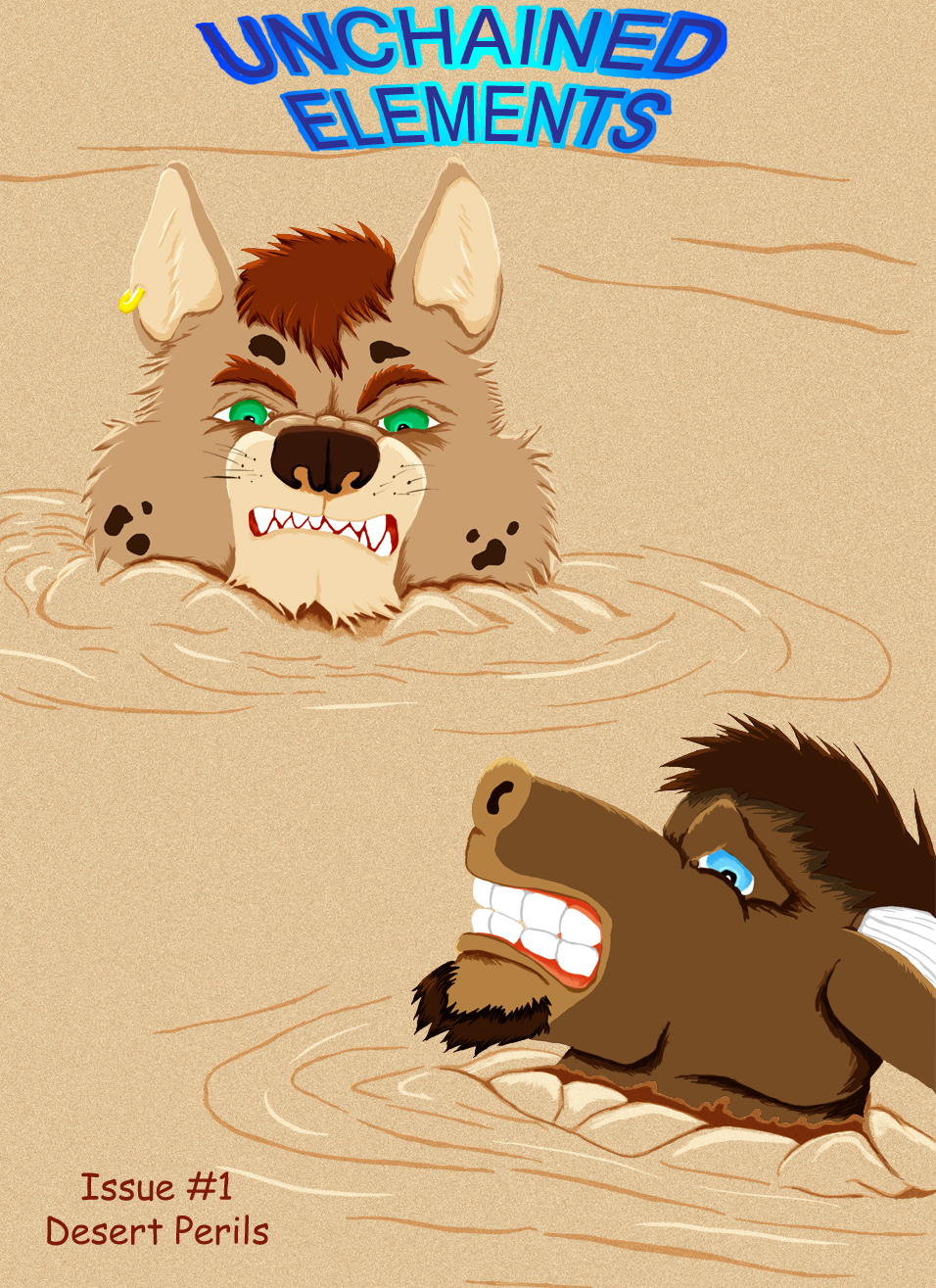
Something I've been working on here and there a cover to Unchained Elements. Sort of an in between scene pages 7 and 8. The subtitle was the best I could come up with. Will there be more? *shrugs* I sometimes thing I'd like to but I think the focus would shift from Burik to Trasull to be honest.
Submission Information
- Views:
- 1569
- Comments:
- 7
- Favorites:
- 5
- Rating:
- General
- Category:
- Visual / Digital
Comments
-

-

Thanks
-
-

Very professionally done, and I think I can see what you were trying to do - make something that mimics a comic book cover. I like this idea.
I have a few things to say about what you could do to improve on this (only if you wanted to of course), and I hope you find this feedback useful. :)- The title text: Comic book covers usually have a dynamic or artistic typeface, but your design here lacks this. Correct me if I'm wrong, but it seems to me that it's not very hard to draw some sort of artistic lettering (ask for some examples if you need 'em). If you are having trouble coming up with a good design, keep in mind that the typeface sometimes takes on an appearance that is inspired by the text (for example, something with snow or ice in the name could have the text looking like it's made of said elements). If you went for that idea, 'Unchained' could probably have broken chain links between some or all of the letters in the word. While 'Elements' makes me think of something 'green' (and I use the term loosely). Occasionally, you will even have the appearance having some relevance to the story in the issue, but although the public loves it, this is an unpopular idea among writers and artists, because the appearance will differ issue by issue).
- The caption text: Most comic book covers usually have one or several captions on the cover, giving a very vague idea of what is in the story. There is a lack of this. Granted, they're not found on EVERY comic book cover, but it is hard to find a cover that DOESN'T have them, because without them, pretty much all you would have is a barcode and the title text. They also usually have a somewhat stylish typeface. Sometimes, the typeface is VERY artistic and dynamic... but only sometimes. In the latter case, it certainly shouldn't dominate the title text.
- The episode text: Episode titles appear less frequently on comic book covers than captions, but when they do appear, they often have an artistic and dynamic typeface. Because these elements are more specific to the story in the issue, you will find their appearance resembling what is found in the story more often (in the case of this, some sort of quicksandy appearance perhaps?). Episode text is typically found embedded in a caption, particularly on comics that only occasionally put the episode names on the cover.
In the event of all three of these things, if making something artistic is too hard, the easy way out (if you have Microsoft Office) is to use WordArt to put something together. It would be a little less original than making something by your own hand, but it would still look good, and you could even use your hand to decorate it after. If you like, I can cobble something together for you.
You should only take these ideas with a grain of salt. I write this not to tell you what to do, but rather to suggest some things you might want to try if you do this sort of thing again.
-
Um no I wasn't mimicing a comic book cover this is the comic book cover for Unchained Elements. True the title is very bland but this comic will never get published, otherwise I probably would go back and clean up the typefaces this was merely done to give a finished more polished look to the comic as I always thought that a cover would be good considering the completeness of the first issue. The subtitle was just something I made up last minute and is undoubtablely the lamest title I could come up with. Thanks however for the feed back.
-
It's actually a good idea to stylise the title page, full stop. Because in a way, the comic is already published, so you need a look that 'sells', as they say. Think about it. ;)
-
I understand the stylized title page needing to sell but I am not going to be selling or publishing this comic.
-
You missed my point. In a way, you have already published the comic. It's on this site. In a way, you are already selling it. What you are accepting in currency is attention. Fans. Prestige. Not everything is about money, you know. ;)
-
-
-
- The title text: Comic book covers usually have a dynamic or artistic typeface, but your design here lacks this. Correct me if I'm wrong, but it seems to me that it's not very hard to draw some sort of artistic lettering (ask for some examples if you need 'em). If you are having trouble coming up with a good design, keep in mind that the typeface sometimes takes on an appearance that is inspired by the text (for example, something with snow or ice in the name could have the text looking like it's made of said elements). If you went for that idea, 'Unchained' could probably have broken chain links between some or all of the letters in the word. While 'Elements' makes me think of something 'green' (and I use the term loosely). Occasionally, you will even have the appearance having some relevance to the story in the issue, but although the public loves it, this is an unpopular idea among writers and artists, because the appearance will differ issue by issue).
Link
Ghostfox
Wow, that's a nice cover!