Sign In
Close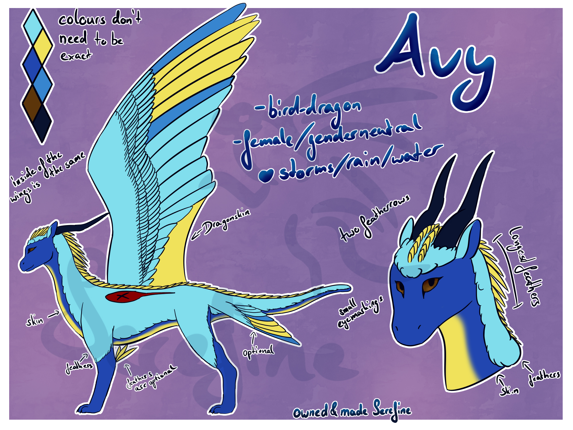

Since in almost one month Artfight is starting I decided to make atleast a basic refsheet of my dragon. I havn´t made lineart I liked in a long time, maybe I start doing it more
Submission Information
- Views:
- 381
- Comments:
- 5
- Favorites:
- 0
- Rating:
- General
- Category:
- Visual / Digital
Comments
-

-
Highlights / shading is just confusing for the artist to draw so I dont use them in Refsheets except for the eyes
-
You'll learn.
-
A refsheet should be so clear as possible and shades/highlight arent necessery and are confusing for the artist who needs to use it
-
Oh, you're looking for critique on clarity.
Dark eye color makes it difficult to see the details on the eyes; alongside the dark blue, it is difficult to distinguish the two as dependent objects. I read the text "Avy" clearly due to it's size, the rest I'm not sure of; using a text font should help. The watermark makes it harder to see. Dark color (red) with cross in the middle is hard to see. It is unclear what the large yellow triangle is; behind the wing.
Adding highlights and shading can help with clearly indicating curves.
-
-
-
-
Link
Daoni
Looks fine. Highlights should help it look nicer. I like the feather pattern.