Sign In
Close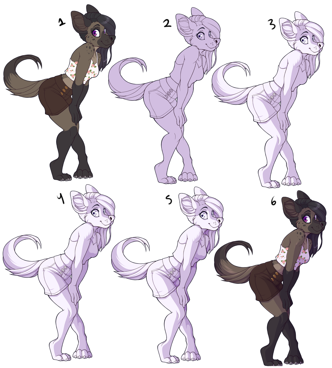
I've had a lot of people ask how I colour, so this is the best way I can explain it.
Disclaimer: I wouldn't call this a tutorial, I am not perfect, a still learning artist. This is simply how I do things, but it is not THE only way to do things, so make sure to try other things as well and learn new stuff! And try not to use this as an example on where to place shading, as that's not something I'm great at myself.
Info:
I use Paint Tool Sai.
What my layers look like: http://i1212.photobucket.com/albums/cc453/sbneko/Do%20not%20Delete/NewCanvas2_zps479820ca.png
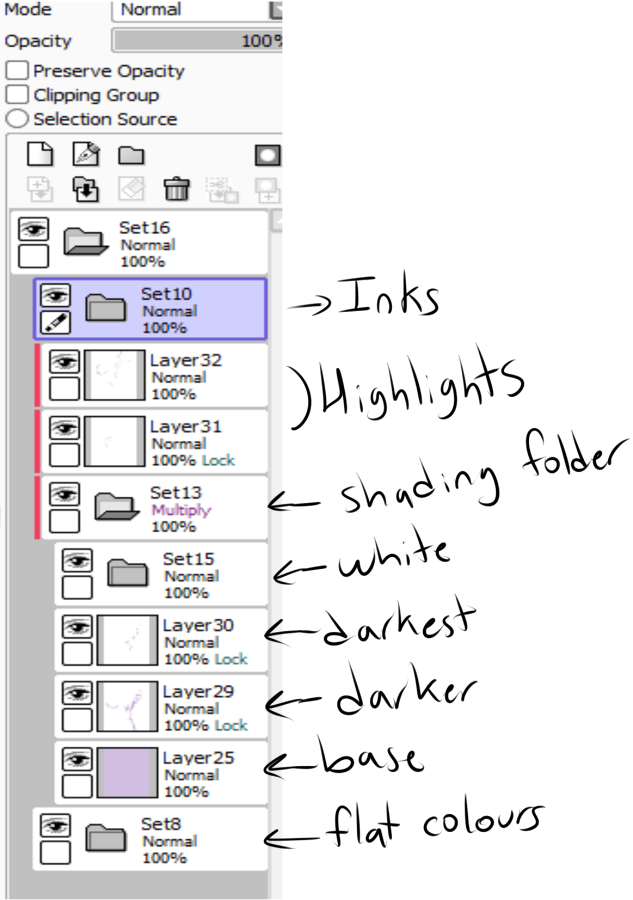
1: Flat Colours
2: Shading base. (Note: The folder is currently not in multiply mode).
3: White or off white where I DON'T want shading. I shde backwards personally, I put down where I don't want shading, rather then where I do.
4: Some darker shading in some areas, less then the base.
5: Even darker areas, a little amount of it.
6: I change the folder into "multiply", so you can see it shading the character. I also added a few highlights, I either do that directly or use overlay layers.
I may also add more gradients in the shading, or add textures to the image.
Submission Information
- Views:
- 1691
- Comments:
- 7
- Favorites:
- 37
- Rating:
- General
- Category:
- Visual / Digital
Comments
-

-

Oooo I'll try this style out as well!
Yay another shading technique for me!
-

Thank you thank you THANK YOU for posting this! I'm gonna try it out!
-

This is really neat - thank you for sharing!
-

I can never get multiple layers of shading like that to look even half decent so I usually stop at one layer of shading.
What doesn't help is that I usually set the shading to really funky ass colors so it would probably look even more awkward
6m9;;
-

If you don't do something because it looks off you'll never improve at it. I certainly don't really love the way I do it, I still need to improve.
Now if you -want- it to only be one layer of shading, that's another thing.
-
For most of my art I think a single layer seems to do the job just fine. For my painting style work I use a totally different method entirely for shading so I'm not even gonna bring that up.
Ah shit I remembered just now that there sort of IS a picture I did which SORT of has multiple layers of shading like this. In a way.
https://www.weasyl.com/submission/434888/the-seven-deudly-whatsits <--it was this
Basically most of the characters in that set had a shading layer that was white and various shades of purple and looked like what's going on in step 4 or 5 of your tutorial thing, minus the lines.
I basically made the shading layer by starting with the darkest shade of purple I wanted to shade with and lightening it as i went.
and then Wrath had an EXTRA layer on top of that which was similar (purple on white, set to multiply) but it had his crash test dummy wood grain on it.
-
-
Link
NaumWolf
i really appreciate that you shared this with us all, i'm gonna have to try this next time i color... i always try to shade after the fact, then get frustrated and give up becasue i cant get it to look right.... this way makes a bit more sense to me