Sign In
Close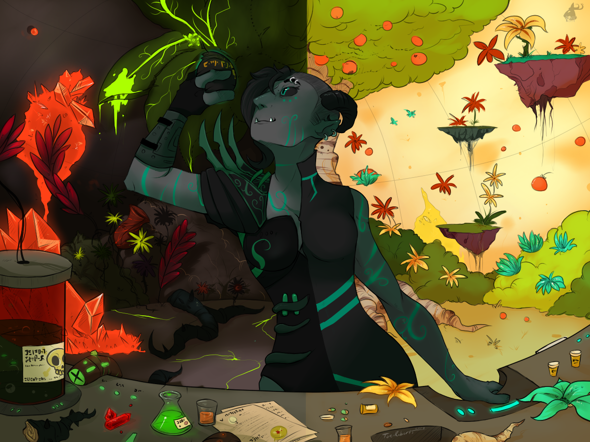
As a note: I'm open and hoping for a little creative criticism today guys.
For this particular commission for my friend Haze, It took me a couple tries to get this to look how i just about wanted it. (Had to start from scratch a couple times). But this is one of the few more complicated drawings ive done ever really. So if anyone has any sort of tips, criticisms, or just general commentary it'd be much appreciated.
Aside from that: This was a commission to draw my friends most used OC. A lyxaris. Ive drawn lyxaris before, its his species, but theyre a very interesting race of aliens. Highly evolved, technologically superior to most. This character here, Mercy as she prefers to be called, Is A surgeon and a military officer both. She designs both weapons of mass destruction as well as medicines. A fun character to roleplay with honestly.
Submission Information
- Views:
- 793
- Comments:
- 2
- Favorites:
- 4
- Rating:
- General
- Category:
- Visual / Digital
Comments
-

-

Thank you! Im always open for a little feedback. Critique is how you grow as an artist. And I can see where youre coming from. As I'm looking at it what youre pointing out makes perfect sense. Especially the hand as ive noticed someone else told me something similar on a different site. I'd think now in retrospect it would be facing more at a sideways angle than showing the back of the hand to the audience. As for the rest of your advice, I shall take it into consideration for future work. I really appreciate your feedback. ovo
(Also i have no idea how people work without separating the layers. I had literally somewhere between 15 and 20 layers on this piece.)
-RenV
-
Link
korpinkorva
Criticism, eh? I find it very rare to encounter someone who hopes for it! I find this piece interesting and delicious with all the little details and colors, so allow me to represent some tips which could be useful to consider in the future:
I think you've generally succeeded with the background. All the objects have some kind fo a shade or glow, which makes them look authentic. However, I would make the background a little paler with some kind of a "wash" or gradient. That would make the character and the items in the foreground pop up more nicely. This would probably require that the fore- and background are located on different layers while working on the piece.
Secondly, the left arm (right arm of the character) looks a bit like it's drawn into a flexing pose to the side of the character, rather than up and in front of the character (like you normally would lift something to be examined). English is not my first language though so I can't explain it well, but I would gladly show my suggestion with a redline, if you're interested.
As for the last tip, I'd be more bold with the reflections of the glows surrounding the character, such as orange light from the crystals on the left. It could be a very thin orange highlight. Then again, I'm not an expert on coloring so there could be other solutions too.
I find the dualism of this piece, it makes the piece a delight to look at - there are so many things and contrasts to explore. Hopefully my notions are of some help!