Sign In
Close Eenyuwolf needed a logo for her fursuit business,
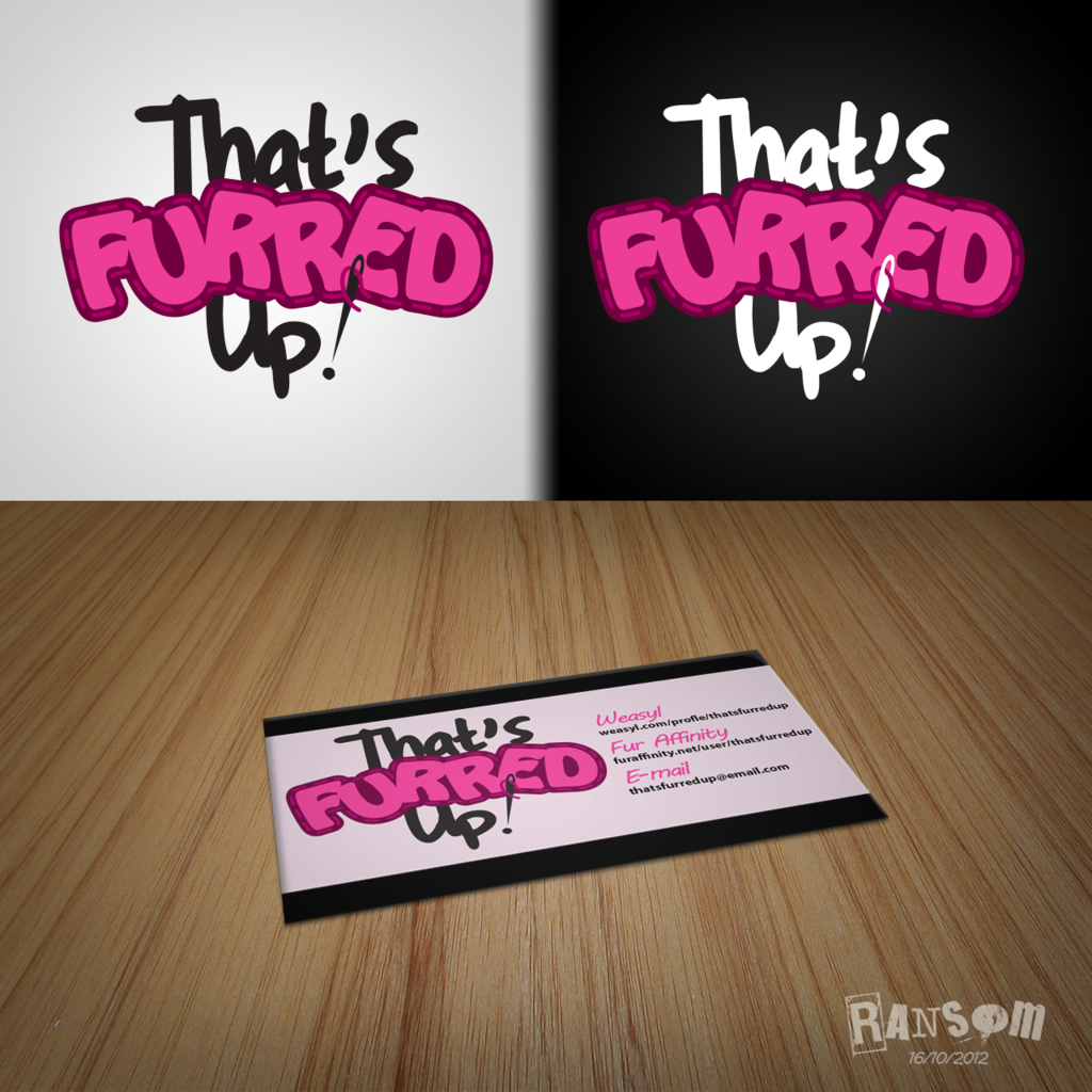
That's Furred Up!, and I'm here to deliver! You can see two variations of the logo—one on a dark background, one on a light background—as well as a mock-up of what the logo could look like in-action, on a business card!
This is going to get detailed, but it's important that I explain the choices to Eenyu, as well as anyone else who might be curious about graphic design.
It's been a while since I designed a logo. It always was the most challenging part of graphic design for me, but I'm happy with how this one's turned out. I put quite a bit of careful consideration into it.
First and foremost, I sketched a number of designs on paper to test compositions, typeface styles, and the like. After talking to Eenyu about what she wanted her business to portray, I came up with a design that was fun, friendly, and cartoony.
One major thing I wanted to do was avoid the cliché of using a paw print in the logo. A lot of people default to the paw print when designing anything furry-related, so your business isn't going to stand out if you use a paw print to identify yourself in a sea of paw prints. I think the best logos are the visual puns, the ones that give you an idea of what the business is about at just a glance. I hinted at it here by turning the exclamation point into a needle and thread.
When I had an idea of what I wanted to do, I busted open Illustrator and went to work. When it comes to logo design, it is essential that you work in vectors. If you draw it in Photoshop, you fail right from the get-go, because you just drew a raster-based image. A raster image will pixelate and distort as it's scaled, whereas a vector image will look as crisp on a billboard as it will a business card.
The colours were the last part. I always save colour for the end when I design a logo, for two reasons: first, I want to ensure that the design reads well in just black-and-white, even at very small sizes; and two, I don't want to get distracted playing with colour schemes, wasting time. If you're designing for a client, the client also has a tendency to nitpick the colours before the design itself, so again, save colours for last.
I decided to keep it playful in the theme of Eenyu's business, but also simple—magenta and black/white—for good reason: simplicity is key in memory. The simpler the design, the easier it is to memorize and reproduce. You want people to remember your business.
Also, gradients, textures, and layer effects are often tacky and don't always transfer well to other mediums. That's why most designers only use flat colours.
I always design with print in mind, and this thing will print economically. This might get a little dry, but I'll explain how.
You know how your computer printer prints, right? It produces its range of colours by mixing four inks: cyan, magenta, yellow, and key (black)—CMYK. Commercial offset printing presses, the kind that can bust out newspapers, books, brochures, and billions of business cards, work by mixing the same colours, but they go about it in a different way. Instead of dotting the ink onto the paper, they use cylindrical plates. These plates have the images etched into them, so that ink collects in their grooves, and are then pressed onto the paper, like a rolling stamp. That's why they call it a press. The thing is, every ink you use in your project needs a separate plate, and each of those inks and plates costs money.
One way a skilled designer operates is by being conscientious of the production costs of their work. In this instance, I've limited the logo to colours that can be created by mixtures of black and magenta—two inks, and thus, only two plates. It is possible to order a special, pre-mixed Pantone ink, but the colours I've chosen are super common inks that will be available from any commercial printer in the world.
Basically: If you ever want a professional printing run, this is simpler and cheaper to print from an offset press than other designs.
Also, in case of plate misalignment, this design will only have minimal distortion on the edges. The text and stitches will still remain legible and intact.
So, bottom line: What you've got here, Eenyu, is a lighthearted design that states what you do at a glance; with bright, bold colours that will print reliably and cheaply; and it can all be scaled to any size you want without losing any quality.
Enjoy!
Submission Information
- Views:
- 1358
- Comments:
- 3
- Favorites:
- 3
- Rating:
- General
- Category:
- Visual / Design / Interface
Comments
-
-

Thanks a lot, Bob! I'm glad someone enjoyed me geeking out about the design process, haha. It's actually a lot of fun sharing my knowledge, plus it forces me to remember what I was taught, so it's good for me too. Maybe I ought to make a tutorial sometime.
-

I may not have any graphic design talent, but it's nice to logo vicariously through others, and write ups like that are super cool to read. I think a tutorial would be a great idea, especially as creative personal/business identities in the fandom deserve more than "I just make a picture in photoshop, right?"
Commissioning personal/fursona logos, branding and calling cards would be kinda neat, actually.
-
-


Link
Bobskunk
I really like the stitching/needle motif, and that would have been cute enough- but reading your about process, rationale and other considerations is really interesting. Good call on avoiding paws, color-last, and the ease of printing/reduced impact of plate misalignment.
Not that it can be explained in anything less than a book, but you've outlined some really effective techniques and pitfalls here- I've seen way too many raster logos and "oh it's just like my inkjet, right?" that (might) have been avoided with a concise and straightforward primer like this.
Great work!