Sign In
Close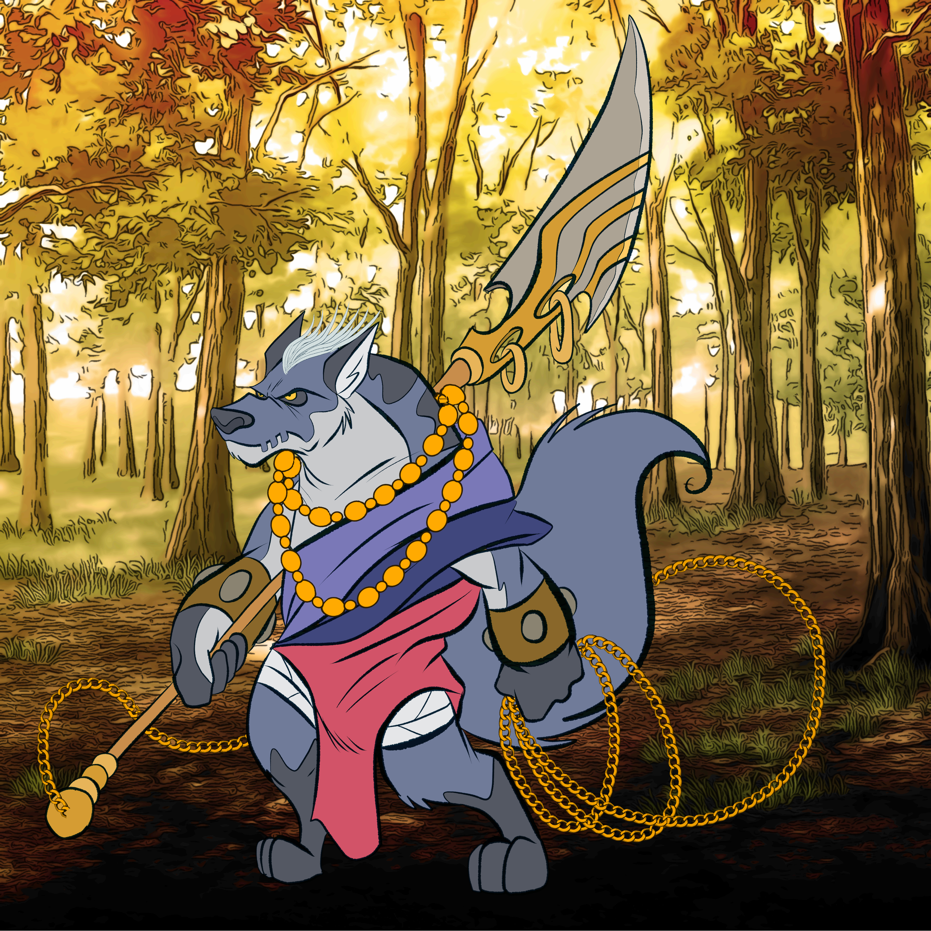
fanfic character design for a customer
Submission Information
- Views:
- 178
- Comments:
- 2
- Favorites:
- 0
- Rating:
- General
- Category:
- Visual / Digital
Comments
-
-

hola, thanks for the advice, and yes, i know the colors contrast a lot, two reasons, one, my favorite painting school is impressionism, so, sometimes, i let colors just do their thing, sounds weird, but that's what i do, and second, the main subject was the character, so, the contrasting colors help to make him more visible.
-
Link
Serabourg
hi there!! i really like your character design. it's very expressive <3 what i noticed right off the bat--even from the thumbnail, was that the colors of the BG and of the character contrast a LOT against each other. maybe if you gave the wolf a more reddish tint, or hue, they would fit better with the forest. also, stuff like the tuft of white hair, the yellow necklaces and the chains have thinner lines than the rest of the wolf. maybe that would be smthng to look into? anyhow i hope i was of some help. the framing's nice, i hope you make more content for your oc C: have a nice day