Sign In
Close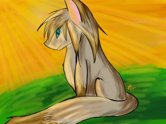
Umm.
Submission Information
- Views:
- 478
- Comments:
- 3
- Favorites:
- 0
- Rating:
- General
- Category:
- Visual / Digital
Comments
-
-
gahh thank you so much for the critique! (heh heh. . . . it's not that often I get good critique like this :'D)
Looking back at the icon in itself, I can see some of the mistakes you pointed out. Rest assured, I continue to improve on the tips you gave me. (Especially with the breasts. I always seem to have a problem with them :'D)
All in all, thank you co much for both the compliments, and the critique! it means so much to hear it! ^w^
-
Ahhh glad its helped in some way?? I hope I wasn't mean ahaaaaaaaaaaaaaaaaa T v T
Boobs are naturally hard lmao :'DDD I struggle loads with them
<333 Good luck in the future with your art! You definitely have loads and loads of potential, so keep working hard!
-
-
Link
Samooraii
Right! Humm, I see you'd like a critique so here goes! Plus I'm itching to help someone along with their art because I currently can't draw pffff. :'D
I'LL TRY MY BEST TO MAKE THIS UNDERSTANDABLE
Lets start off with her hair. I'm loving the smooth texture you gave it and the wonderful highlights not to mention how well you made the parting, but there are couple of things that could give it a bit more depth and texture. Try making her hair a little messier, because unless it's slicked down with hair gel, then there are going to be some hairs flying messily and not completely shiny and smooth. Also try to determine a light source, because if you do it will help immensely and spread out the highlights and shines better. Pretty nice overall. : )
Quick say-something about the eyes, very well done! I love the style you used here! To make them stand out a bit better though, it would be good to put a 'shine blob' from were the light is coming from. Once again, determine where the light is coming from. It'll save your character from looking blankly into nothing. Also on the eyebrows, try making the front of them a little thicker than the rest of the brow.
ONTO THE BODY! Okie dokie, lets see here. The skins shading could do with a bit more detail, like the amount of detail you put into the hair. Also try to use maybe a pinker/lighter/orangery color here, it will look a bit more natural with this style. She also has an insanely cute nose and mouth, great job on those babies! One thing that will make the girl look well... a bit more girly, is reducing the thickness of her neck. That thickness is usually only used with men to give them more of a buff look. If this is a dainty lady, I suggest making her neck slimmer.
I really like the way the dress shapes her body, and the color is definitely cool. On her chest, you should probably put two separate lines between her boobs, cause even with a special bra her boobs wouldn't be that close together. :33 The last thing I'd like to mention before I go onto the background is that you should probably shade in where her boob shadows are or it may look like her boobs are just flat on the same level as her tummy.
The last thing I'd like to talk about is the background. I would have thought, since shes in an evening dress of sorts the background would be nighttime. But since that's not my choice I'll show you how to make this already pretty background into a masterpiece. Instead of using a 'highlight blue' for the sky, try to go for a softer, less intense background color, as it takes the attention off of the pretty girl aha! Also try to pop a gradient in there and maybe throw a few not-so-obvious clouds in too. I love the darker color you chose for the grass, its pretty much perfect. A bit more detail on it would have made it look even more gorgeous. Finally as for the heart, I suggest you use a softer less contrasting color. It hurts your eyes a little against the blue.
Uhhhh I really hope this helps and sorry for any typos (in a bit of a rush)! Good luck!
uwu <3333
~Seaside