Sign In
Close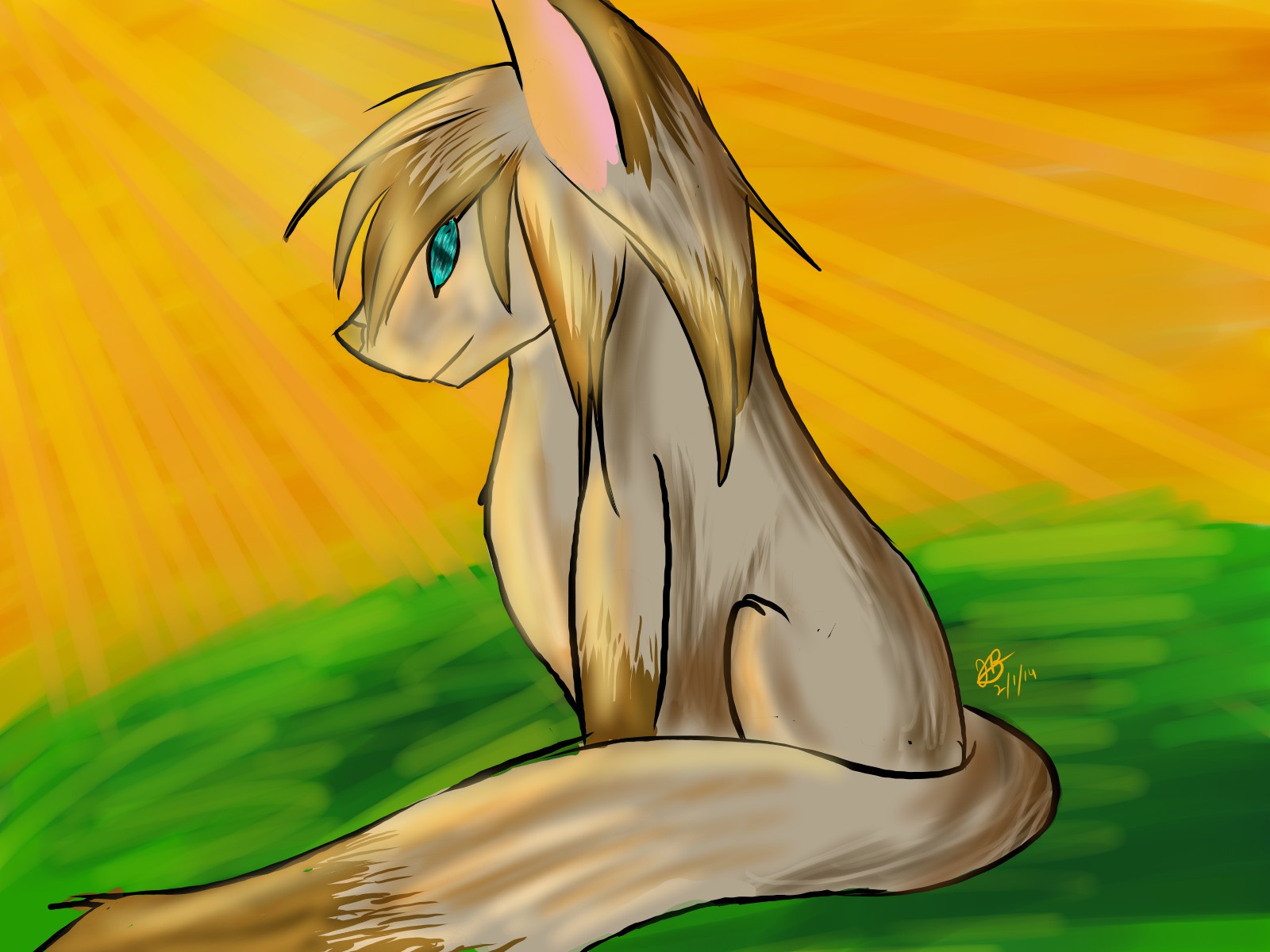

This is just a digital piece to practice the new program I got ^^
See more at my dA: otakuotakuvocaloid.deviantart.com ^^
Submission Information
- Views:
- 279
- Comments:
- 5
- Favorites:
- 0
- Rating:
- General
- Category:
- Visual / Digital
Comments
-

-

The program I used is called FireAlpaca, a program I'm still learning how to use :3
I was hoping I could get some critique on anatomy, shading, and things around that, but either way, thank you! :D
-
oh firealpaca is good! i use it for inks sometimes
i have A Shading Crit but before i babble: how familiar are you with color theory?
-
I love the program! This was my first drawing with it,and I'm glad to say I like the outcome! (Not as good as my recent art, but Still good :'D)
Color theory? I'm currently working on completely understanding it, but I fee I know a decent amount on it. . . ^^"
-
hmm, ok! i took the liberty of doing a quick tweak on the pic as it's easier to illustrate what i'm saying, i hope you don't mind:
there's different kinds of palettes, and overall, the one you used in this picture uses a lot of browns with a huge splatter of green across-- which is almost directly across the color wheel from brown/orange. this isn't inherently a bad thing, but they're also almost the same value(lightness), which makes everything feel kind of muddled together. i tried pushing the greens more toward yellow and it pushes the background 'back' a little bit. (as it is, to my eye, it seems to 'swallow' the character instead of resting behind them)
-
-
-
-
Link
xan
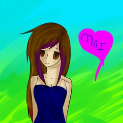
what program was it? looks like PS maybe?
not sure what you want crit on!