Sign In
Close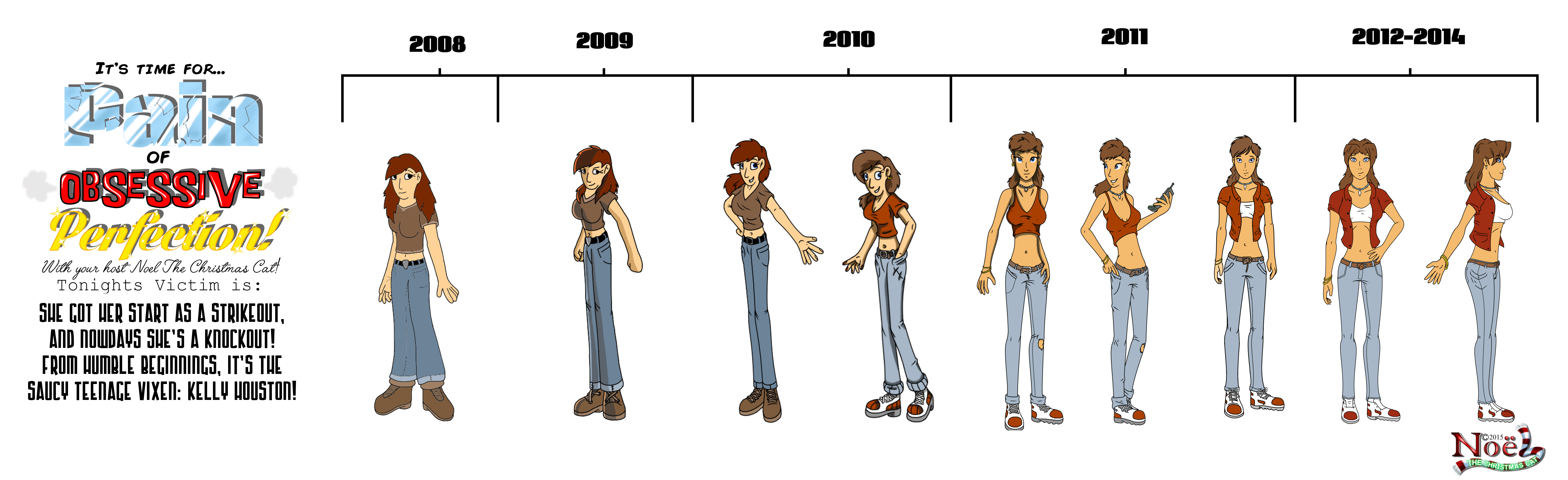

Hello and welcome to a new art trend I’d like to start. I dunno if it’ll catch on, but I’m definitely keeping it round for some of my stuff cause, trust me, there’s a lotta hurt to dish out here. But I’d like to welcome you to a new little art segment I like to call…
*PAIIIIIIIN OF OBSESSIVE PERFECTION!!!! **
*Roll wheel of fortune them song here.
This focuses on an incredibly bad trend that some artists, and by some artists I mean myself, find themselves in. As your work evolves, the accumulated skill catches up and slowly but surely old stuff no longer satisfies you. You either move on to newer and better things or you attempt to remould the old stuff with these new skills. Both paths lead to more work, which is always a payoff, but it also sometimes leads to a steady decline where you suffer the Pain that comes with Overly Obsessive Perfection. That’s right… You’re neck deep in POOP! And you gotta swim to the surface of dat poop, and take a look back at what you left behind and just… cringe.
So for the purpose of the POOP show, I take a character and look back on all the different evolutions of them as my work progressed, the good and the bad. And this is rough for someone as militantly (and perhaps needlessly) obsessive as I have been. In my case, I like to think of it as a very dark portion of my works’ history, that took place from about 2008-2013. The period when I started not only getting back into drawing, but getting into digital drawing for the first time. I’d just picked up gimp, it was all new to me, and it was gruelling, rewarding but also painful path to a needlessly looooong ass learning curve!
And we’re gonna demonstrate some of the pros and cons of POOPing today :3. These are all actual past references I used for characters. Some were finished, some semi finished enough to satisfy my needs at the time. I’m thinking of doing one of these each time I complete a present day character design. Which means you can probably guess what’s gonna follow this upload? But let’s see the steady marathon of crap before we get to the gold nugget, shall we?
(No, I don’t know how many I’ll use or how long I’ll milk this pun either! :3)
Without further ado, let’s dive right into the POOP!
TODAY’S VICTIM OF POOP: Kelly Houston (Human form)
2008 PERIOD
First and foremost, I need to point out that at the time, the goal I set for myself was to make a design for Kelly that would be a fairly normal girl, but one that would have a design as striking as Jade from BGAE. She’d look like a kind of strong, female protagonist akin to that games’. I wanna make it clear that the fact I thought I succeeded… should tell you everything you need to know about 2008 me.
Horseshit! Make the concession for digital stuff I know; I was just starting after all. Fancy things like “Layers” and “Cell shading” were dreams in the sky to me. But I still don’t think that excuses the shoddy, terrible character design, I admit. It’s so bland, the proportions are so wonky, no drawing technique is even close to grasped and just about every rule of drawing is broken here. It was a legit starting point - That’s about the only good thing I can say about it.
2009 PERIOD
By now the digital stuff was starting to sink in and become comfortable. The shading actually doesn’t look all that bad for a starter, but concepts like DPI sizes and scaling were still foreign. Which led to a lot of very tiny, borderline pixel drawings I did. The small size was very easy to work with but didn’t leave a lot of room for compulsion in the art, which is a big drawback. Plus the sensibilities of anatomy seemed to be getting worse then they were before!
2010 PERIOD
You’re seeing one half of the year, and the other. At some point, something snapped and I wanted to go full cartoonish, like Disney level cartoonish. Which led to the creation of Arielly on the right there. The plus side was: playing round with the design and the palette there, I started to come up with something a little more striking. Some kind of base design that didn’t look as bland as the past. Nonetheless, it didn’t excuse the wonky anatomy which was starting to get Bayonetta level bad, as you can see. It also didn’t distract from the point that became more and more apparent: The style I was drawing in was simply too small and pixelated a format. It was time to upscale if I ever wanted to go pro.
2011 PERIOD
So not only did the resolution get an upgrade about here, but I tried to be far more realistic in my use of anatomy about now. The result: several words come into mind for that. “What is this, I don’t even?!” sure sounds about right. Um… “OMGWTFBBQHAX?” really rings home too. Gosh, hard to pick. I mean, you guys might think this is not that bad, but there’s something about that design and it’s proportions that… just rubs me the wrong way. It looks… eugh, I have many thoughts, but I can’t put them into words. I don’t even know how that design came to be, btw. Granted it’s not as bland as 2008, but there’s something about that just doesn’t scream special to me.
The third picture, despite still having a bit too big a head and a seriously maladjusted face, was when Kelly started at least looking like Kelly, as you can see.. This was the point where I was close to breaking out into what I wanted. I took a little break period about here and starting working on other stuff to see if I was happy with these kind of proportions. Ultimately it needed one final polish. Or so I thought…
2012-2014 PERIOD
So about 2012, due to a certain person who poked way more then every Sasquatch mainer in Darkstalkers ever did in their lifetime of usage… I started to get back into the drawing and story work! If only to show some of it off to said person. I started incorporating a few anime tricks into my otherwise very western style and came up with a bit of a hybrid. Almost Avatar-ish was what people were TELLING me, which I took as a huge complement at the time and tried to milk a bit. It lead to a slight hairstyle change for Kelly along with the anatomy tweaks, which led to… well, lets be honest here… Aerith! Really, it’s those bangs at the front that seemed to cement that for a lot of people, and the rest of the design just happened to be along for the ride. Despite all of this, I chose to keep it and see how much I could make it work, and as you can see, I kept this design for the longest time of them all! It persisted when I got into actual uploads. About the end of 2014 however, the POOP kicked in again. My work wasn’t quite complete…
Thank you for sticking by me for Episode 1 of “Pain Of Obsessive Perfection!” I hope you had fun, I hope this was a learning experience, I hope this catches on as I had fun writing it up, and I hope some people realise that, hey, your work ain’t quite as bad you think it is, is it?! At least you didn’t live my grace period from 2008-2013! If by some chance you did, then boy do I feel for you man! Swim outta that POOP soon as you can! :3
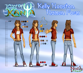
And there’s one more silver lining. Click here to see the 2015 reimagining!
https://www.weasyl.com/submission/956713/kelly-houston-2015-redesign
Just where has the POOP taken me now? This is your host, Noel the Christmas Cat! Catch you soon guys!
Submission Information
- Views:
- 556
- Comments:
- 0
- Favorites:
- 0
- Rating:
- General
- Category:
- Visual / Digital