Sign In
Close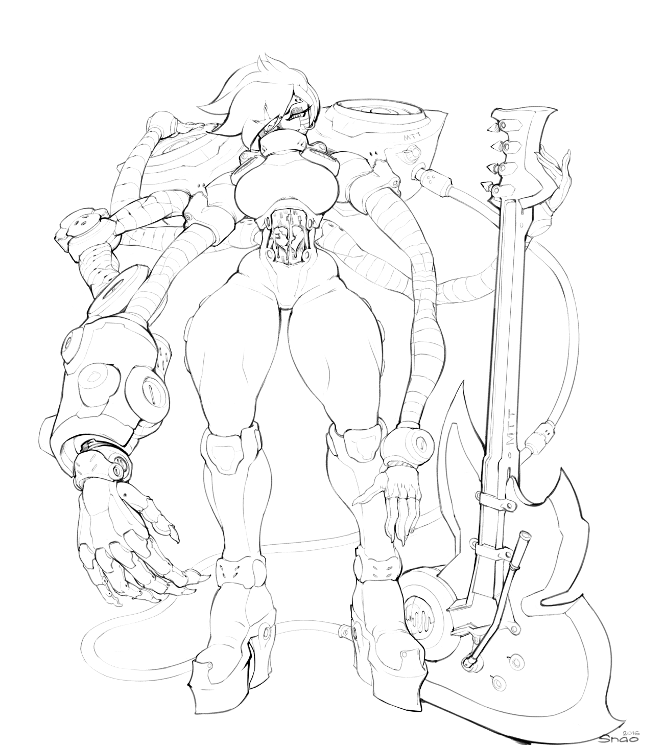
Meta again. I like messing with Meta's design although to be honest it is rather difficult because.. At first I thought it would be very easy because the design allows for a lot of freedom given a few key conditions..
1: is a robot, and robots can take literally any shape.
2: theme of entertainment is valuable.
Those two conditions give you a landslide of options to mess with from the real world. From game shows including sports events, to fishing for snow crabs on reality TV.
But I think that those conditions are wearing on me mentally because it ends up making everything look out of place.
This is why you shouldn't think too hard once you start. BLEF.
To be blunt, I don't like everything about this image because it has a lopsided-feeling focal point. It feels like Im looking at a horseshoe. idk. Im overthinking it I bet?
The depicted character is 18+ years of age.
This is not a scene that respects canon.
Patreon Tip Jar (NSFW / R18)
Personal Tumblr (NSFW / R18)
Art-Only Tumblr (NSFW / R18)
*TWITTER (NSFW / R18)
PIXIV (NSFW / R18)
Submission Information
- Views:
- 2177
- Comments:
- 20
- Favorites:
- 54
- Rating:
- General
- Category:
- Visual / Digital
Comments
-

-

Why thank you!
-
-

Can't help but wonder how much Alphys must have sweat when building that body :D
-
Like a nerd.
-
-

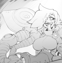
Someone or something broke his heart?
-
Si
-
-

Oh noooo his SOUL is broken. And leaking! This must be a going away concert.
As far as the design goes, idk- I think it fits the character canonically. He's over the top, tries new things constantly. The design looks like a natural result of an eccentric trying to reiinvent himself. not so much body dysphoria, but more like misunderstood genius that's ultimately ugly to the layman. So this fits.
The aesthetic is decidedly Naoki. Realism with curves, great attention to detail. It's just so over the top, with so many bells and whistles that it seems loud and unwieldily. I think it works though.-
Thanks. I think a lot of it works. Just needs to be tightened up.
-
-

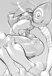
Such a sexy rockstar-bot. I really do enjoy the silhouette he has in this <3
-
Mmmmm. Thanks.
-
-

; 3 ; those robo hands are really nice!~
Every time I draw robots I just cheap out and draw a line across the human shape. But those plated segments you've done look really nice and mechanical.
; A ; Oh yes!~
-
It's ok. Robots can take any shape.
-
-

I can see the focal point thing a little bit? All in all it's a good application of your style to the Mettaton concept.
-
Thanks
-
-

I think that people fall back on beings that don't have to obey proportions when they become frustrated or dissatisfied with the way their ordinary work looks.
Being able to exaggerate is useful, but sometimes it can be taken too far. (kind of an odd place to say that considering but oh well)
I've gotta say that I don't particularly like the arms. To me they look disjointed; perhaps a little too disjointed. I definitely see the horseshoe shape. The huge hand and the guitar mark the ends of the curved shape.
There are lots of parts that I like by themselves; the hand and back item both look great alone. However they don't seem to fit together quite right. That's my opinion, anyway.
-
It is a valuable opine, and one that reinforces a lot of my dissatisfaction with the pic. Thanks for spending the time to consider the image.
-
-
I'd love to see a series of broken hearts from Undertale. Just, character with cybernetics keeping them alive so they can keep up the fight against Frisk/Chara.
-
Mmm. Jus Metaton tho
-
-

He's trying to give Muffet a run for her money in arm count. They should have a bake off! owo
Your robotic designs really fits Mettaton!-
ahaha thanks. It was a bit of a struggle
-
Link
Drazelle
This is really cool! I like your design and line quality in this very much. =]