Sign In
Close
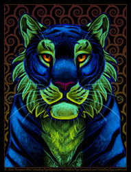

This is for a change of icons that got WAY out of hand, but I like it! Painted to look similar to the color palettes blacklight paints throw. Might go back later to up some contrasts. I'm hoping to refine this type of palette further and get better contrast out of it. Painting in eye searing colors on purpose is a big challenge, but it stands up pretty well doing the grayscale value check.
Submission Information
- Views:
- 421
- Comments:
- 3
- Favorites:
- 18
- Rating:
- General
- Category:
- Visual / Digital


Link
Mortalvis
This is crazy gorgeous. Great stuff!