Sign In
CloseBadge for baitos by Leeden (critique requested)
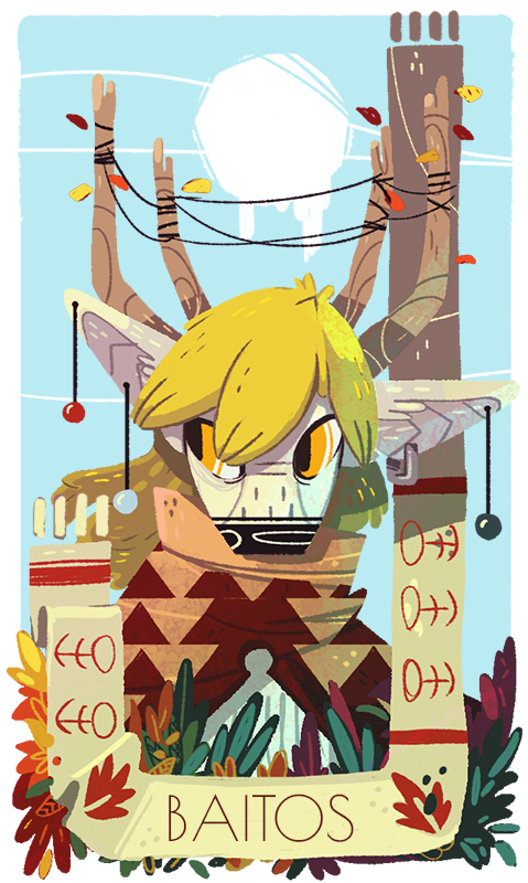
Something for Baitos. Name isn't sure yet though.
Submission Information
- Views:
- 933
- Comments:
- 10
- Favorites:
- 62
- Rating:
- General
- Category:
- Visual / Digital
Comments
-

-

omg shaaaaaaapes :D
-

Woah I absolutely love the style on this one
-

That was the only thing I could find to criticise: that the sharp clean typography of the name looked out of place among the lovely rough textures. But if it's only a placeholder, to be overdrawn by hand once the name is decided...
-

I agree. In fact i'm looking for a font that could be a bit more rough or handwrited style. I think i should create my own with my current set of brushes but i have no idea how to do that. ^^;
-
-

This is lovely! The color shifts in the foliage on the bottom is really gorgeous <3
-

The style in which you render things is just awesome, I can't even omg.
-

Absolutely beautiful!

Link
Scatterplot
Oooh, I want a badge! How many dollars??