Sign In
Close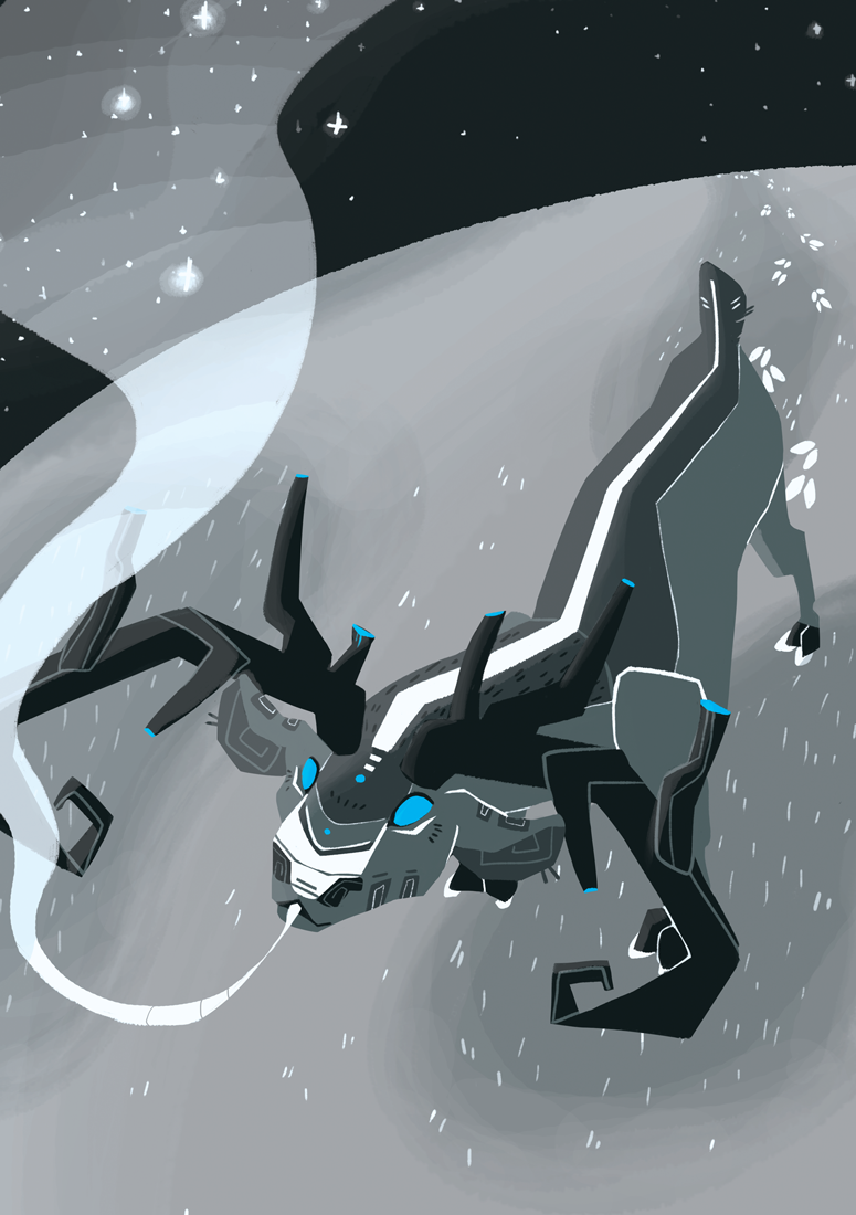
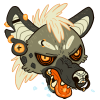
Picture done for a fanzine.
Feel good to paint a bit more freely :) I've been stuck in a wild artblock lately. Thanks for always being around !
Submission Information
- Views:
- 569
- Comments:
- 2
- Favorites:
- 21
- Rating:
- General
- Category:
- Visual / Digital
Comments
-
-
Thanks a lot for your comment and your help ! I was wondering what people would think about the name as I didn't find the whole composition very clear myself. Emphasizing on the weak side of the deer could have help, you're absolutely right ! Thanks a bunch again, very helpful.
-
Link
moxiclean
i like the geometric shapes and the blue makes for a good contrast. the hue is particularly pleasant.
i think the palette could have been a little more muted to emphasize it, and the titular "last breathe" kind of looks like its slurping down a ghost that strayed too close. Or, it could be interpreted as the soul leaving the body. if the deer was more sickly or weak in appearance, maybe lower to the ground, it would have conveyed the message better.
assuming that is the intention at all. its what i saw in the piece.
otherwise, solid.