Sign In
Close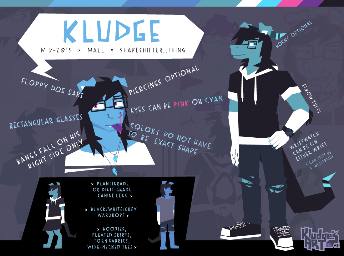
![[GIF] Love Hearts with Asa](https://cdn.weasyl.com/static/media/55/17/83/551783001d4763d194c74d3a3ac05f3aa4220325df873312f217a0b303239560.jpg)
Today renders my old reference's "early 20's" bit of info as no longer valid, but hardly anything else has changed since then.
Haven't really decided on some shoes yet, but I think the mostly solid-color clothes don't need such a textured pair of shoes as before. Maybe they'll make a return when I figure some other clothes out. I honestly haven't built a wardrobe IRL because, to put it plainly, I don't have a dependable stream of income to not feel guilty about making purchases that aren't necessities—such as fun and fancy clothes. And I know I don't have to have things IRL in order to put them on my fursona, but... I just like seeing him wear stuff that I actually have (or, mostly close to, since I've simplified how the hoodie actually is). I don't know why I didn't just draw him with the shoes I normally wear then, but. Um.
Well, this is still just a simple reference sheet to give the basics. The full detailed one has been in unfinished purgatory and will probably remain as such for a while...
Submission Information
- Views:
- 169
- Comments:
- 7
- Favorites:
- 7
- Rating:
- General
- Category:
- Visual / Digital
Comments
-
-

Thank you, I always found making reference sheets a challenge: getting all the necessary info in, as well as making it visually appealing. Hopefully I didn't just luck out on this one, and that future references of my other characters are just as cool too. I'm just glad to have the old ref sheet on hand, and be able to contrast how I've at least improved a bit on layouts since 3 years ago, heh.
The colors at the top were a decision I made right at the end. I don't really feel like color swatches are too necessary on ref sheets at this point—since myself and many others seem to just color pick right from where they are on the character, then adjust from there—but I felt like the composition was slightly lacking in the color contrast, and having another area of bright pink somewhere seemed good. It also compliments the bottom border a bit and keeps it from feeling too heavy, I feel.
-
I hear ya—as I still do mine traditionally, I have to use reallllllllllllllllllly large paper (usually comic boards, 11x17) to try and get the important bits on there that I need. :)
In today’s digital universe, color swatches are probably not needed as they used to be, for sure. I think it was a good decision, for balance, to make it like a border! :D
-
How do you end up capturing the larger sized paper when you're done? Taking a picture or just have a huge scanner?
-
I’ve had to resort to photos for the bigger things. I used to be able to try and scan them in multiple pieces and then match them up in Paint. But when I got the last scanner, it has a mind of its own on scan sizes—so I could no longer piece multiple scans together. laughs
My iPhone works most of the time, but I get a steadier picture when I use my iPad more recently. Not sure why, but even when I have my phone flat-parallel to a drawing—it still tilts at an angle. But I never get that with my iPad! XD
-
-
-
-
-
Is there inspiration that made you make him a lizard/dog hybrid? It says he's a shapeshifter but this 'default' form I'm assuming, because I really do like the design.
-
It's been so long since I made his first design (which is arguably not that different from back then, other than clothes and hair), but I'm pretty sure when making him, my ultimate design prompt was, "What would seem appealing to me?" Floppy dog ears seemed fun, but I also wanted to have a non-doglike nose on a character for once (though, it's still an option, anyway). I found myself torn between options on other areas, and decided that he would be able to change various parts at will, for whatever reason he felt like being (or I felt like drawing) at any point. I can't remember at what time that I decided on the name: if that was before, during, or after designing his appearance, but it sure packed up the design with a neat little bow.
These were some visual design inspirations from back then from what I could remember: [1] [2] [3]
One day, I'll finally be able to get out all the details about Kludge's design, but this is indeed somewhat of a default form. I keep being back and forth on the horns, as they're somewhat of a random color that's not really found anywhere else on him. Porcupine quills would be fun again though, but colored like the horns. Or maybe some kind of jagged unicorn horn in the front instead of a pair of backward ones. These sorts of things are just what randomly come up, and I like not being too strictly bound to design limitations.
-
![[1]](https://file.toyhou.se/images/474269_n67WiX52w8EBkDb.jpg)
![[2]](https://static.wikia.nocookie.net/futret/images/8/8a/ULTIMATE_FUTRACKS.png)
![[3]](https://upload.wikimedia.org/wikipedia/en/4/4d/Scar_lion_king.png)
Link
keirajo
I do like this simple one—it’s different than many standard ref sheets I see and gets the design points across. I like the subtlety of the colors as a bar at the top—it makes it also like a “page border”. :)