Sign In
Close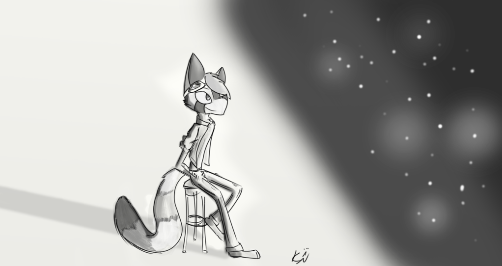

A gift for my friend Taridium!
Art (c) Myself
Tari (c) Taridium
Submission Information
- Views:
- 585
- Comments:
- 8
- Favorites:
- 3
- Rating:
- General
- Category:
- Visual / Digital
Comments
-
-

this is really lovely, you've got a nice style going here!
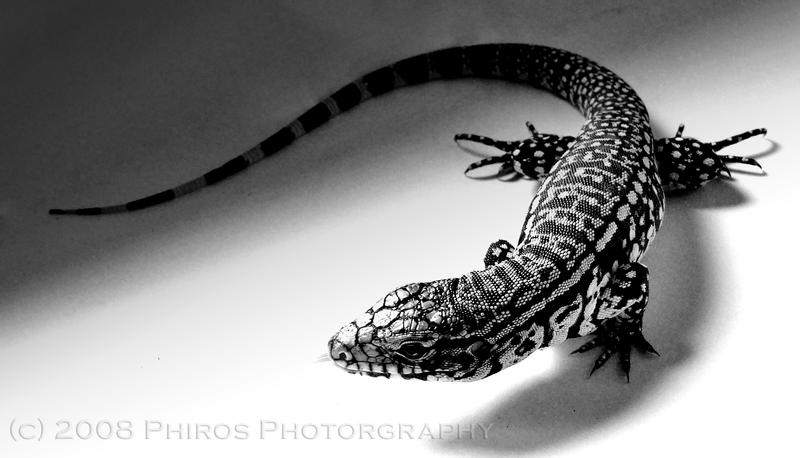
I personally love working in monochrome, its a nice way to practice lighting and mood, and makes learning to shade easier than referencing with colour values. A few things though; I would suggest though, is having a smoother transition between the the light and dark (this is of course, depending on the scene and objects, but because the edges are blurred like they are, its a little hard for me to tell) and while the shading on the character is nicely done, I do think it's coming from the wrong light source. Since the white is behind Tari, I feel as though the shading should be placed away from it, or below (with a light source coming down on the character- http://img05.deviantart.net/5d57/i/2008/027/c/4/black_and_white_tegu_by_bitis.jpg)-

Thank you so much for that incredibly insightful comment!
As for transitions- I totally agree! Soft gradients always make a piece look better (except when going for a cell shaded piece). However, my current art program doesn't really support smooth gradients so I try my best with what I have to work with. (In the very near future I'll be upgrading)
As for shading/light source- what I intended was the light source being the stars. This was sort of hard to portray because the white is overpowering- and often means light. However I'll totally incorporate the idea into future pieces.
Again, thank you so much ^w^
-
you're most welcome~ c:
oh, what are program are you using? (if you're after a good free program, take a look at Krita, it has its bugs here and there, but it's free so I can't complain~)
ah ok, I see that now! and yeah, white can be quite a difficult colour to work with at times XD
no problem!
-
-
Link
DalethFox
Nice job. I'm usually not a big fan of B/W, but this is really good^^