Sign In
Close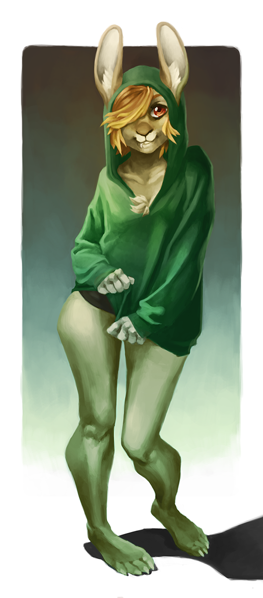
A commission for
Submission Information
- Views:
- 660
- Comments:
- 5
- Favorites:
- 9
- Rating:
- General
- Category:
- Visual / Digital
Comments
-

-

Thank you!
I get your point. For drawings like this, I always use reference to make sure it looks right but I do tend push the poses a lot and stylize by bending the limbs and sometimes I take it too far.
I hope I don't sound defensive. It's very refreshing to receive a bit of critique sites like Weasyl and FA and I really appreciate it <3
-
-
right, i understand that. i don't think that the bending its self is the problem, its that it clashes with the rest of the body. but its still a great piece! thanks for taking my comment so well, i was a little worried. :)
-

Uhh, I kind of strongly disagree with Kamalayana's comment?? To me the legs are what make this drawing great. The super exaggerated angle on the hips and knees gives the pose a lot of energy even though the character is just standing still. It's okay for the stylization to be extreme since the style overall is pretty blocky and toony.
Maybe the lower right leg could be a little more straight, but that's the only problem I have with it.-
Thank you for the input! I see what you mean, less bending on the lower leg could have done it.
-
Link
Kamalayana
the top half looks great, and the shading is really nice, but the bottom half looks a little wonky. i don't understand why you painted the leg like that, it looks deformed. no offense or anything, i mean i really like it and i can tell that your very skilled so im baffled by the legs.