Sign In
Close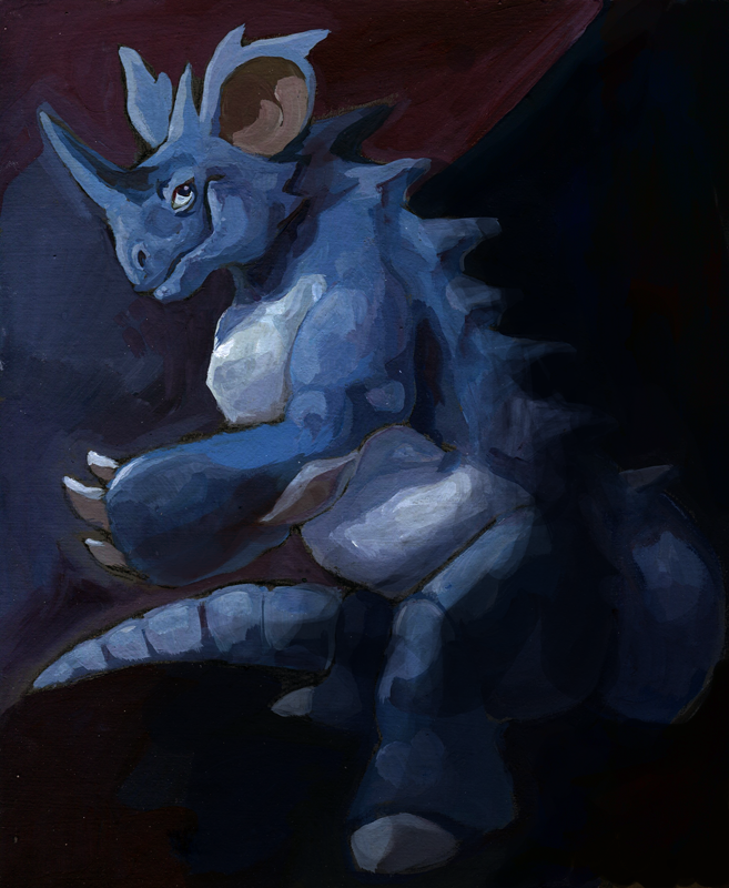
I've told Halybs that I'm taking Pokemon request on some forum and she asked me to draw one of "these angsty and angular Pokemon like Nidoking or Aggron". We've both suffered to get a shiny Nidoking some time ago, so my decision was quite obvious. I wanted to make him angsty and bloody at first, but in the end it's as melancholic as most of my artworks.
Tempera painting with limited use of colours (ultramarine, white, umber, carmine) + computer edit.
I don't like it but I've painted it during some kind of an artblock.
January 2014!
Submission Information
- Views:
- 610
- Comments:
- 2
- Favorites:
- 13
- Rating:
- General
- Category:
- Visual / Traditional
Comments
-

-
Hello...!
Thank you very much for such wonderful critique...! I'm just speechless, as I read lines of your comment...it's so helpful and kind, thank you so much for your time and knowledge!
I wasn't fond of this artwork, to be honest - I had a lot of problems with it and I wasn't satisfied with the final result, that's why your comment is even more helpful for me. Thanks to you I know what should I practice! That's just great. It's wonderful to know how to start!
I love the way Rembrandt used light,so this tip's really nice for me! I'll certainly study it.
Now I see...! Thank you very much! Now I know how to improve it next time.Yes, you're definitely right with the composition. I had no idea how to organise it here... I make thumbnails of my ideas from time to time, but I've forgotten about it this time. That was a big mistake! Your composition really helped the picture, now I understand it. Thank you so much!
I really don't know what could I say. I just read everything you said here and I can't stop nodding "yes, yes, yes!" You're certainly right. About everything. I'll have to practice this hard! It's great to have an idea what should be changed, though. I wouldn't manage to do it by myself! What's fun, I'm a student of an art school as well, but my teachers doesn't want to give me any real advices. Yours are a lot better and uderstandable!
I definitely haven't planned redooing it, but now I see it's a great idea, thank you! I'll see how could I improve it.
Thank you very much once again! You're great.
-
Link
tessary
Hey there! You requested critique on this? I'd be happy to help (:
I really like the colors you've chosen, especially the presence of maroon. I also think you're going in the right direction with the lighting, but I feel like it could be improved a lot, and pushed more to really give a solidity to the forms being lit; at present they feel a little flat rather than dimensional. I highly recommend studying Rembrandt and the Chiaroscuro style of lighting. Another thing that gives dimension to forms is stroke direction; which you seem to be aware of in certain places, so I would continue to work on that. (The only place where it works against you is the color in the background, you've oriented the stroke direction around his horn and hand so the background seems to be forming directly in front of him rather than behind. ) Also, I would manipulate light to push the tail more into the background, it takes away too much attention from the main form of the figure.
I feel like the two major things that let you down in this painting are the composition and the treatment of the edge. It feels like he's been squeezed into the square of the painting; note how the edge of his tail and foot are tangent with the edge of the painting. Good compositions give the impression that the painting extends beyond its borders. Don't be afraid to have certain parts of the subject "cropped out". Here's a visual suggestion of an improvement on the composition: https://dl.dropboxusercontent.com/u/42195086/nido.jpg
I'm aware that with character art, it's important to have the whole character shown, but this is far more of a painting than it is character art. Or, you could go in the opposite direction and "zoom out" like I did above, which would mean you'd have to take care to orient light well in the open space. (again, I would study rembrandt for his treatment of open areas of space in paintings) This is where a background can be very helpful. I'm glad you have the beginning of a background behind her but it appears to be just color rather than anything- I think it would work making it into velvet curtain like the ones against the walls of medieval castles.
I'm not sure whether you do this already or not, but before you start a work it's a good idea to make at least six to ten sketchy thumbnails to pick the best composition, and get a second and third opinion on which one to go ahead with. (my teacher gave me the advice of making a page of the most cliché compositions I could think of to get them out of my head before starting the real thumbnails)
The last few things I could say to help are, be aware of what angle the subject is being viewed from, the persecutive here is a little off. I feel like the different parts of the subject have been observed from different angles- namely, the waist and legs are being viewed from a 3/4 and slightly higher-than-subject angle, the ears are just 3/4, the back spikes from 3/4 behind, and the face, arm, back and tail are straight side-on. While this technique is used by cubist artists like picasso, I don't quite think that's the style you're going for here.
Finally, I feel that the pose is a little awkward, I would take the same approach of using thumbnails to decide on a pose that fits with the composition.
I've written a lot, so I hope it's not too much to stomach! I have to give and receive crits in class five days a week at the Rhode Island School of design, so I hope what I said was helpful to you.
I really like the direction you've started with for this, but I think it has a lot of room to be improved on. It might be a really useful exercise to have a second try at this painting, if you're up for it! I feel like I improve the most at my own art when I redo a work after it's received critique. Good luck (: