Sign In
Close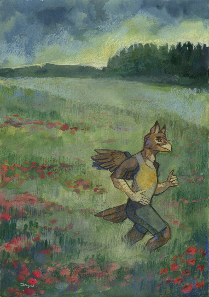
(Soft shading) YCH for FA@ Corviform! It really was fun to do!
Submission Information
- Views:
- 600
- Comments:
- 6
- Favorites:
- 9
- Rating:
- General
- Category:
- Visual / Traditional
Comments
-

-
Thank you so much! I'm looking for a way to make my landscapes interesting at the moment, so it means a lot!
-
-

wow mega ładnie sie prezentuje ;w;
-
Dziękuję stokrotnie! ;_;
-
-

Really dig the style on this one! You are very skilled with all sorts of traditional media. Since you have requested critique, I shall give my two cents on what to consider with future works!
The forestline in the background has a nice contrast and gets the attention when glancing at the work for the first time. The composition is wonderful and encourages one's gaze to wander from a detail to another. Now I don't know if the scan has distorted colors slightly, but I'd love to see more of that similar 'glow' in the middle of the work, to give the entire piece more contrast. The paper could glow more from beneath the paint, or some more layers of crayon could be added.
The flowers look delicate and lovely in the foreground. I like that there are various hues of red. However, in the mid section of the piece they would appear to be more vague in shape, and the shade of purple is a tad too dark for the lighter area.
I also like the overall body shape and style of the character. Everything about it seems to be in place, but maybe you could consider exaggerating the pose a little bit: now the legs look like they're walking, but hands appear to belong to a character that is running, if you get what I mean. Also if most of the light is emerging from behind the forestline, weight of shadow on the character could be in the middle, instead of the left-hand-side.
Hahah, I hope this wasn't too much critique for you, sorry! With all that said, I must add that I really like the piece and I hope to see more watercolor works from you in the future.
-
Thank you so much for the critique! I'm really bad at writing long replies (especially in English), but I do appreciate that - and it helps me a lot! I agree with everything you said - except for the compliments, I guess - you're just way too nice for me! Thank you very much for that.
I'm not able to fix these mistakes anymore, as I sent the original already - but everything you said surely will help me in making new drawings better!
-
Link
SpiderMilkshake
Lots of beautiful simple textures here! And this griffin fella looks very relaxed in his environment! ^^