Sign In
Close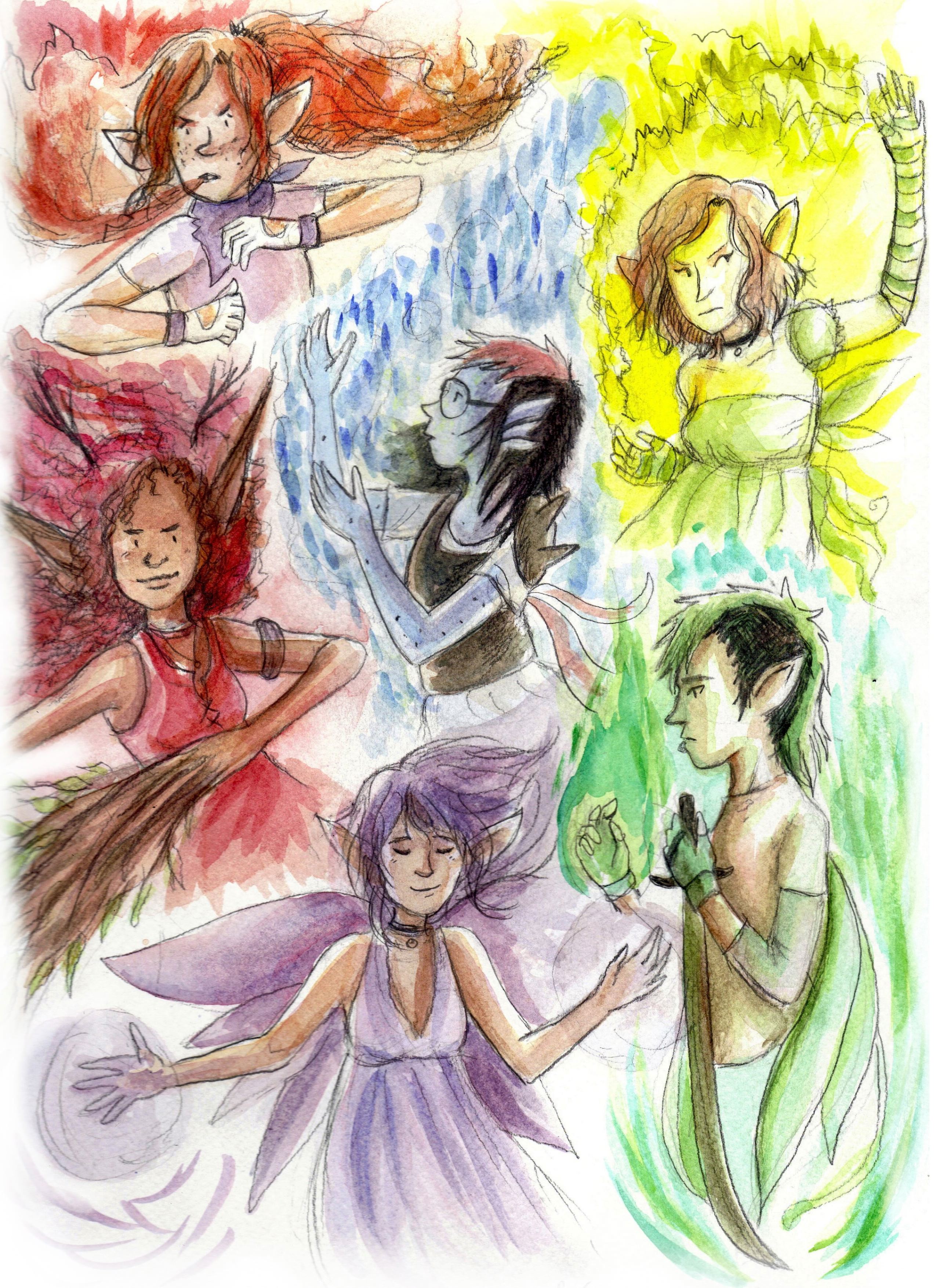
i thought id start out by posting a group image of my fairy characters! i write comics about them and draw them and one'a these days im going to write a graphic novel about them.
Submission Information
- Views:
- 207
- Comments:
- 3
- Favorites:
- 1
- Rating:
- General
- Category:
- Visual / Traditional
Comments
-

-
MY CHILDREN /SHOT
-
Alright, I'm gonna break this down into characters, anatomy, linework, colors, and other technical values. Okay? Rad.
Characters
Alright, without digging up information on these characters specifically, I can only say so much. However, I can draw a pretty strong preemptive conclusion on the development and research put into the characters. That conclusion is that wow, you've done a huge amount of research into fairies and put a lot of thought into design and concepts here. Your characters are diverse, from their facial structure and anatomy to their emotives. Particularly, I love the thought I can assume was put into the myth behind fairies and how different types of fairies have different traits, but also how the characters individually are different.Particularly, I adore the freckles on the arms of the water fairy, the mousiness of the one I assume is lightning or just some sort of yellow element, how the fire one has that lovely red hair and freckled face but those bat ears and that cute purple getup to balance things out. The earthy red/magenta one has those wonderful ears with great anatomy for the detail level, and I adore the various tones in her skin. The green one just reminds me of what I like from my characters, and I like how he and the purple one are the only ones with prominent wings that I can see right off. We forget that the fairy type doesn't have to be fair, thin, and donned with butterfly wings. Very good characterization, in that I can get some basic ideas of your characters just from this illustration.
Anatomy
The structure of the arms and faces, the most prominent anatomy I see, are well-done and well-studied. Hands are flawed in some places, but still show good structure and study. The anatomy looks confident and shows both study of concepts and introduction of style with good balance.The clothing has a bit of a lack of dimension, with most of the cloth seeming to stick to the line of the body without fold. However, it doesn't look bad, it just looks like the characters don't wear baggy/floofy/etc. clothing, which can be okay. There is some good knowledge of folds of clothing and some texture work, but only a bit. That can be okay, though, and shows subtly that prevents the over-working of detail that can distract from the focus of the characters themselves.
Linework
Some sketch lines seem to remain in the piece, but they reflect the working piece theme that the loose colors reinforce. Linework is diverse and uses thick, thin, and multiple lines to add detail. Some areas are a bit thick/dark, but not offensively so.Color
The wide variety of colors used in areas that could have been represented with a single color are amazing and aesthetically pleasing, and are handled well with good knowledge of color theory. Things are kept subtle but well-versed.Conclusion
A strong piece that shows research and study and is aesthetically pleasing. The style is almost storybook-like, or as if someone sat down in a forest with some watercolors and painted all the fairy friends around. Definitely a beautiful piece!
Link
Cytric Acid
YAS NOEMI AND THE GANG /SHOT