Sign In
Close

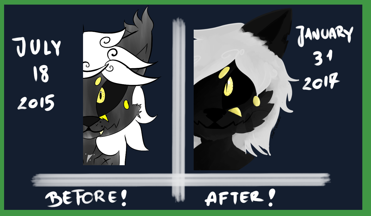
Now the meme
Improvement is obvious~
Check my gallery to see the detailed version
Submission Information
- Views:
- 550
- Comments:
- 1
- Favorites:
- 1
- Rating:
- General
- Category:
- Visual / Digital
Now the meme
Improvement is obvious~
Check my gallery to see the detailed version

Link
sugarfurs
I'm not sure which picture to post the critique on, but your character is incredibly dark. This was my first thought when I saw it on twitter. With a character that is supposed to be black, you should never go all the way black because of the fact that you won't have any contrast. The mouth and features are nearly impossible to make out and I have my brightness turned all the way up just to be able to see the previous one. To be quite honest without any kind of value change, it's impossible to see improvement on anything aside from the technique you used on drawing the eyes because the details are lost.
You might want to try using a more tonal piece like the first one. Maybe try using a hint of blue or red in the fur. Even purple on the fur's base would give a nice contrast to the yellow.