Sign In
Close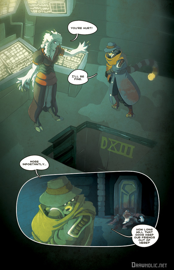
Hey guys, enjoying the comic? Please consider throwing $1 a month at me via Patreon! The more support I get, the more pages I can produce each week! And supporters get access to the entire month's pages at the start of each month!
Thank you!
Submission Information
- Views:
- 666
- Comments:
- 2
- Favorites:
- 2
- Rating:
- General
- Category:
- Visual / Digital
Comments
-
-
Thanks much for the feedback! A lot of good stuff I'll be rolling around in my head while working on new pages. The criticism regarding "lazy or shortcuts" all falls decidedly on the "shortcuts" side of the equation. I restrict myself to only about 8-10 hours per page in order to keep momentum. Often, corners are cut to keep that pace. Still, this highlights things I need to work on.
While I try not to spend time making changes to finished pages, you're spot on about the blood and additionally I think it would add some much needed colour to the page. I might spare some time on that when I can manage.
I really appreciate the comments regarding the writing. This is an aspect I don't get much feedback on and I tend to fret over it. This is my first stab at writing horror.
-
Link
Bahumat
Well, critique is requested, and I've never seen your work or this comic before. I just clicked on it because the thumbnail looked interesting, off of the front page, so this is as raw and novel a critique as you could ask for:
Your lighting and shading in the first panel, in the top left, is great. Even better is seeing that you preserved that light source in panel two below. The shading that follows it is quite good, though I did note a lack of a sharp line of shadow for the pit thing they're standing in front of.
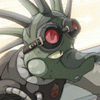
I can't tell what the hell is going on with the faces in these pictures. The sheep... thing has some sort of square protruding from her nose, what? And in the panel below, the cat-raccoon-thing's eyes are hilariously wrong, not at all lined up with his muzzle. It looks like someone took the top half of Paddington Bear's head and twisted.
You've got so much definition and detail in other elements that when you get lazy or take shortcuts, it really jumps out in a way it wouldn't with lesser work: It bothered my eye that the computer displays, especially the 'keyboard' things, were painfully obviously hand-doodled in instead of precise as one would expect from a computer. The structural column in panel two to the left of the door stands out at a glance as not being straight upright; that's a placement where using a ruler or straight-line tool would have mattered. Blood, dried or fresh, is much more red than that, and not nearly as transparent. It looks like someone splashed soup around, not the blood flowing through someone's veins.
Simple, clear, clean writing, that compels the reader to want to learn more about the comic. Dialogue reads well as real people speaking. I would suggest replacing "our friends" with "them" unless there's established plot reasons for the sardonic note by the cat-thing.