Sign In
Close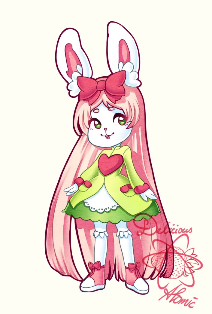
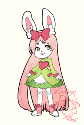
We finished the Bunny we've drawn previously to add some dimension to the shapes. Do you like the previous version better, or this one?
~ Delicious Atomic Circle
Submission Information
- Views:
- 182
- Comments:
- 2
- Favorites:
- 0
- Rating:
- General
- Category:
- Visual / Digital
Comments
-
-
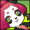
Thank you so much! Now that you said it we noticed that the blue shading on the white fur makes it stand out a bit too much perhaps. Maybe some pink reflected light could make the piece more coherent... Thank you very much for your feedback! :) It means a lot to us that you spend your time commenting on our pieces, thank you!
-
Link
Rococospade
She's even cuter with shading. The saturated colors and subtle rim light are lovely, and the faint paper texture makes it feel more like something I could reach out and touch without becoming too much. (I hope that made sense...) I probably would have expected pink tones to shade the fur, but the use of blue almost seems to tie into her dress color, and makes her fur seem snowy white.