Sign In
Close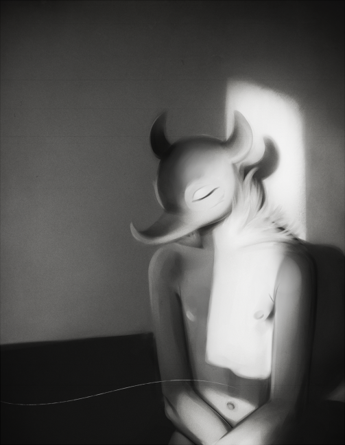
Just a little thing I made while trying to practice painting. Black and white has always been easiest for me so I thought I'd start here and work my way up to color.
Submission Information
- Views:
- 304
- Comments:
- 13
- Favorites:
- 12
- Rating:
- General
- Category:
- Visual / Digital
Comments
-

-

You got nothin' to be jealous of gurrl, back and white is all I know. > n<
-
-

ahh this is really pretty. <3 I love how sharp this is, while still be really soft, and your understanding of value is great. Have you ever taken black and white stuff like this and put color on top of it? *o*
-
Aww thanks! And yeah, I actually talked about doing just that over on FA, haha. I know you basically use overlays of colors with the same value as the greys, right? Sounds easy in theory, but I find it very hard in practice. @__@ I am the worst with colors.
-
there are a couple ways! I usually do it when I'm doing full marker illustrations because it's a looottt easier to add color over grey marker digitally than to find all the right shades (and a lot cheaper, too).
you can create a layer over your rendering with the layer properties changed to "Color" and color over everything. It basically changes all the value to different shades of that color. I did that with these.
Then you can change your rendering to "Multiply" and add color underneath, which I think is a little easier. I did that here.
There's probably different ways of doing it too, but those are the two ways I know how. I hope that helps and I'm not just going on and making no sense, ahaha. ;x;-
Do you work in PS? I work in Sai, and I'm not seeing a "Color" option for layers. If so man do I ever gotta think about switching over, that sounds really helpful! T ^T Time to learn how to use the big guns. I usually use the multiply, screen, and overlay settings for my regular coloring, but when I paint something in greyscale and then try to color over it it just doesn't look right. :T Maybe I'm not picking the best color choices, realism is very far away from what I do now so it's going to take some getting used to, haha. And no you're not rambling, I'm VERY interested in any advice Weasyl peeps have to offer. :>
-
Ohh yeah I use Photoshop CS6. I'm on a Mac and I can't use Sai sadly, so I can't give much advice on how to do things on there. :<
-
-
-
-
-

oh my fucking god I really really like this aughghwoehw.
-
/ U\ B'aww thank you!
-
-

This looks so photorealistic!! you work so well with just a minimal palette of grays
-
Thank you! I only ever worked in greyscale before I switched over to digital art, haha. It's all I know. Q ~Q
-
-
Your soft shading is just AMAZING. The way you've painted the light here is remarkable, you never cease to be an inspiration man!
-
Ahahah thanks! I'm surprised everyone likes this piece so much, it's so experimental I wasn't sure how it would turn out.
-
Link
Clambo
Q OQ Oh baby. My jealousy knows no bounds for your skill.
ahhhh so pretty.........