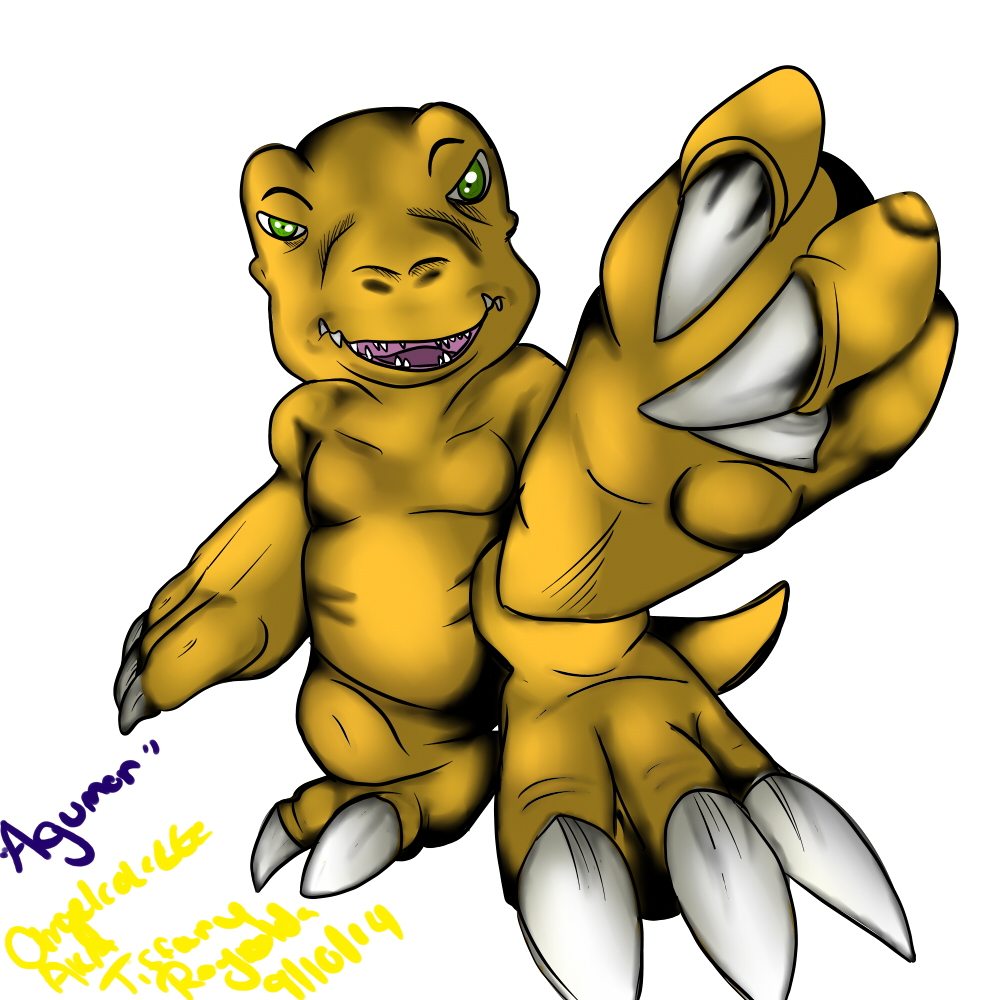
hello! c: I saw your piece and that you requested critique, so I decided I should try my best at helping other artists, haha
first I will start off by saying what I do like about this drawing. the pose is very nice, something lots of artists, (including myself) have issues with. also, the way you used lines to help show shading, in a sense, which really works with this drawing, and reminds me of the official digimon art.
what I felt could be improved is the shading and slight little errors. the shading is more of a pure black, which makes it seem desaturated, and takes away from the yellow. shading with a darker shade of yellow, (and maybe adding in another hue, I generally use blue, so a slightly blue/green-ish yellow in this case) would solve this. it isn't so much a problem on the claws, as they are white. the only minor error I can really see and point out is that the left eye looks a little small.


Link
Cerelia
hello! c: I saw your piece and that you requested critique, so I decided I should try my best at helping other artists, haha
first I will start off by saying what I do like about this drawing. the pose is very nice, something lots of artists, (including myself) have issues with. also, the way you used lines to help show shading, in a sense, which really works with this drawing, and reminds me of the official digimon art.
what I felt could be improved is the shading and slight little errors. the shading is more of a pure black, which makes it seem desaturated, and takes away from the yellow. shading with a darker shade of yellow, (and maybe adding in another hue, I generally use blue, so a slightly blue/green-ish yellow in this case) would solve this. it isn't so much a problem on the claws, as they are white. the only minor error I can really see and point out is that the left eye looks a little small.
I hope I was helpful ^^