Sign In
Close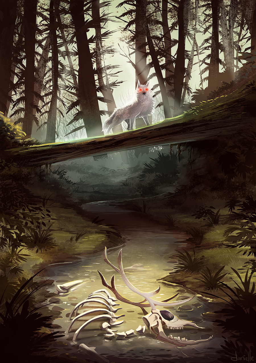
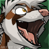
A little Game of Thrones fanart. Eagerly awaiting the new season.
Submission Information
- Views:
- 1006
- Comments:
- 9
- Favorites:
- 54
- Rating:
- General
- Category:
- Visual / Digital
Comments
-
-

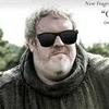
Hodor! Hodor? Hodor....
-
-

Very dramatic and atmospheric! You really nailed it here! <:)
-
Oh man, this is still one of my favorite pictures of yours--it's even in a folder called "Inspiration", that I use to collect art/photography that really strikes me.
If you don't mind a technique question, do you work with opacity mapped to your stylus pressure, or do you only allow pen pressure to affect width? Your gouache/dry-brush look seems like you'd probably map only stroke width to stylus pressure (so no opacity variation), but that's just my best guess!
-
Thank you! I really appreciate that.
Honestly, this whole piece was a lot of messing around. I had just downloaded these brushes: http://soldatnordsken.deviantart.com/art/My-painting-brushes-Concept-art-speedpainting-415473881 and went with it. I don't use any sort of opacity built into the pen, just use normal pressure. For the gouache texture you're seeing I used the gouache brush from this guys tools: https://gumroad.com/kyletwebster - I know it's in the 13$ pack, not sure about the others. I believe it's called "Gouache A Go Go". Then there are a few various other brushes from Kyles pack in there as well.
I really don't do anything fancy. I never change brush settings cause it sort of freaks me out. Let me know if that doesn't make sense, ahaha.
-
Oooh, thank you so much for answering my question!
I already have Kyle's brush pack, but haven't played around with the gouache ones yet--I'll definitely give them a spin, though! I'll also check out that dA brush set, too.
Do you still work from a monochromatic base painting? I remember you used to work that way, at least, and it inspired me to approach digital painting like traditional paints, which has been super useful. I don't usually "convert" my work with a gradient map or overlay layer, though.. it might be less efficient, but I've found it simpler for my brain to just paint over the underpainting.
-
I actually don't use a grayscale base anymore, not since college anyway. Purely because I can never seem to get the colors the way I want them. It's still the best way to get the lights right though, in my opinion. In the case of this piece I did actually do a little grayscale thumbnail just to have an idea of the lighting.
So you do a grayscale painting, then paint over it completely? No color layers or anything? You have so much patience!
-
Mmmm, yeah, I never could get the grayscale conversion to look right.
So, instead I paint with one color to get my values (or approximate values/lighting, at least), then I'll adjust that color to be a base shadow color (usually a desaturated blueish-purple color), and paint in final colors over that. Sorta like here: http://imgur.com/a/PASv7#0
-
Oh dang, that's awesome! I wouldn't have ever thought about approaching it like that. So fun to see how other artists work!
-
-
-
-
-
Link
hodor
Hodor! <3