Sign In
Close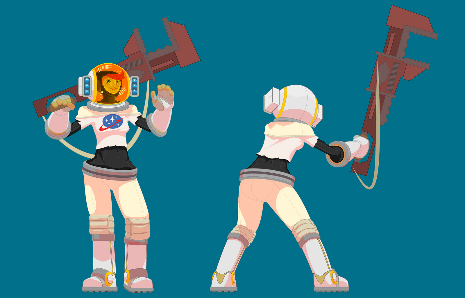
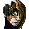
An Illustrator experiment to see how I might render these characters using the same visual system I use professionally for work.
The wrench is clearly needing to be actually rendered in perspective, but this was more about the figure.
Incidentally, Cosmo should always seem to be in a low-gravity situation, handing massive things easily. As opposed to the Mercenary, who is heavily weighed down by all his armor and weaponry and gear and such.
I think this will also help say something about personality too: her jumps are a little higher, she doesn't struggle with manual labor, and is kind of Can-do optimist, etc.
I do like the clarity of the system and will try this with the other characters when they get as nailed down.
Also, red shadows because Mars <3
Submission Information
- Views:
- 659
- Comments:
- 12
- Favorites:
- 26
- Rating:
- General
- Category:
- Visual / Other
Comments
-

-

I really hope the success of Gravity spawns a new wave of spacesuit themed characters
Also reminds me of Dina Karam's Mighty Number 9 art http://wpmedia.o.canada.com/2013/12/mightnumber9.jpg
-

I've done a lot of things lately with Illustrator, just dropping the idea of actual lines. It's pretty cool, right? Not that you haven't done this before, but this is a really keen take on your usual style. I agree about the wrench. I also find the fact that her suit is not entirely the same base color kind of odd, for some reason. I'd love to see the whole series done this way, or really anything you do this way.
-
Ya, if you get down to the nitty gritty of what Illustrator can really do, it's basically the only program you need. It can technically do everything photoshop can do and everything illustrator can do. It's like making images with math :P Experimentation with it can only yield Good Things!
Just today, this very day, I learned about pixel masks in Photoshop, omg OMG if you don't know I have to show you, it's my new best friend!
-
Don't know about pixel masks, I don't think. So you'll have to show me. :"D I will say that there are things PS can do AI can't, most of which have to do with mirroring real world materials. AI isn't nearly as good at that. So what? It's great at lots of other things!
-
-
-

Ah I'm in love with the space suit design, and the character concept is really cute! Really dig the look of that helmet.
-
I want that wrench!!!!
-
wat
i have no idea what happened :Oanyway, THERE IS A FANDOM FOR EVERYTHING
-
omg bizarre!!!!
-
-

Adorable <3
-
As much as I love your usual, looser/sketchier style, it's really cool to see such neat crisp lineart! This character is utterly charming, too-- I love her!
Link
cial
i unabashedly love her specifically for being a spacesuit wearing character