Sign In
Close
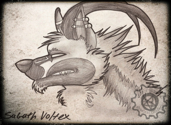
The first in a series of pictures like this I shall be doing C:
This one here is my Scalie-sona Carlie the Wolvalex havnt drawn her much lately so here we go.
In this one I have stuck with the dark carnival/gothic look I am into, I have 3 more of these done atm but will upload them latter...
My scalie-sona usually wears dark canival, steam punk, psychobilly, and gothic clothes in this one she is going with the dark carni theme.
Submission Information
- Views:
- 333
- Comments:
- 4
- Favorites:
- 1
- Rating:
- General
- Category:
- Visual / Digital
Comments
-

-

Thank you for the critique I really appreciate the tips you have given me. I didn't quite notice the pixels in the background before but I now clearly see it, also yes I agree my figure is getting better since about a year ago I was utterly terrible X3
and I know I have a lot to fix up and learn when it comes to anatomy so thanks again for the great tips there for making anatomy better I hope this helps my improvement.For me Breasts can be an issue and I hope I can improve on that quickly and as for lines I tend to ink mine on an A4 paper size so its hard to find the overlaps until I scan that's when it is noticeable I think I should put more time on editing out the overlaps on Photoshop maybe that will make all the much difference. :)
Thanks for the links to they look very helpful! <3 <3
-
No problem! I am all for helping fellow artists out! It's good to know that you have seen improvement. That truly is a great thing.
Breasts can be hard, especially since they're not something covered in a lot of traditional references/tutorials/classes. They're also portrayed rather simply in a lot of media, so it can be difficult to get a good grasp (no pun intended) on boobs!
No problem! If you ever have any questions or need anything, feel free to gimme a shout. :3 <3
-
yes agreed and thanks again for the help C:
-
-
-
Link
godheadharley
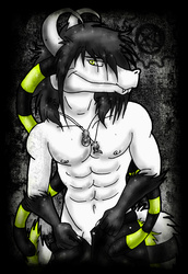
Hi there! Since this was marked for critique, I shall offer one.
Lets begin with the background. I like the overlay of patterns, but it would be very considerate to source the textures. the overlaying spiral pattern as well is not sized correctly for the picture, and it's clearly pixelized. One way to fix this would be to either find a larger size, a vector, or to redraw it on your own. Unfortunately, the mis-sizing is very distracting.
Now, moving onto the figure. Your anatomy is overall pretty decent, and I do like the attention to detail on the mid-body. She is well-fleshed out, which as a personal preference, I enjoy. The head is a bit large for the body, and is placed sideways on the head while the neck still faces forward. It would be uncomfortable or even painful to hold one's head like that for more than a few seconds. A 3/4 view would likely be better for this pose, or turning the body to match the head. The tattoo on her right arm doesn't look very precise, and does not contour with the curve of her arm.
Her breasts are problematic. Breasts are not really spheres, they are shaped more like a water balloon pinned to the chest. The fat in the breasts, which is what they are made of, has weight and is squishy, not hard or overly dense. Spherical breasts look unreal, even breasts that are heavily augmented have more shape. I will link some tutorials at the end you may find helpful. The nipple placement is also very off (assuming the bandages are covering the nipples. Nipples usually follow the mid-line of the breast, and are below the half-way point, often being placed farther down on larger breasts.
Her arms are a bit short for her presumed height. I would work on hand anatomy, as it can be one of the most difficult things as an artist, but prove to be very worth working on. Look at your own hands for reference when sketching, as that can be infinitely helpful. A last trivial bit is that the stockings look off. Stockings work by compressing to the legs, and so would pinch in on the leg, causing an indentation at the top, especially on someone with larger thighs.
Finally, we come to technique. The lining is very shaky and inconsistent. There are some places where lines cross that should not, breaking the illusion of a 3D form. Careful examination after inking can prevent this. The shading is also quite light, and doesn't create a lot of depth. The texture in the shading does not make a very coherent texture on her body. The places which should be shaded much darker (such as where the thighs meet the body) are not. The lack of highlights also breaks the illusion of form. The sparkles are also a bit distracting, because they also appear in dark shadows, where lights shouldn't be reaching.
Welp, I hope that helped! I put down just about everything I could easily find. Overall, just keep practicing!
Here's some links you might find useful:
Brest Tutorial: http://nuei.deviantart.com/art/The-Easy-Breast-Tutorial-343813936
Great Art Tips: http://philmcandrew.tumblr.com/post/5588480161/super-obvious-secrets-that-i-wish-theyd-teach-in-art
Tons of pose references: http://lockstock.deviantart.com/gallery/
Figure exercises: http://artists.pixelovely.com/practice-tools/figure-drawing/