Sign In
Close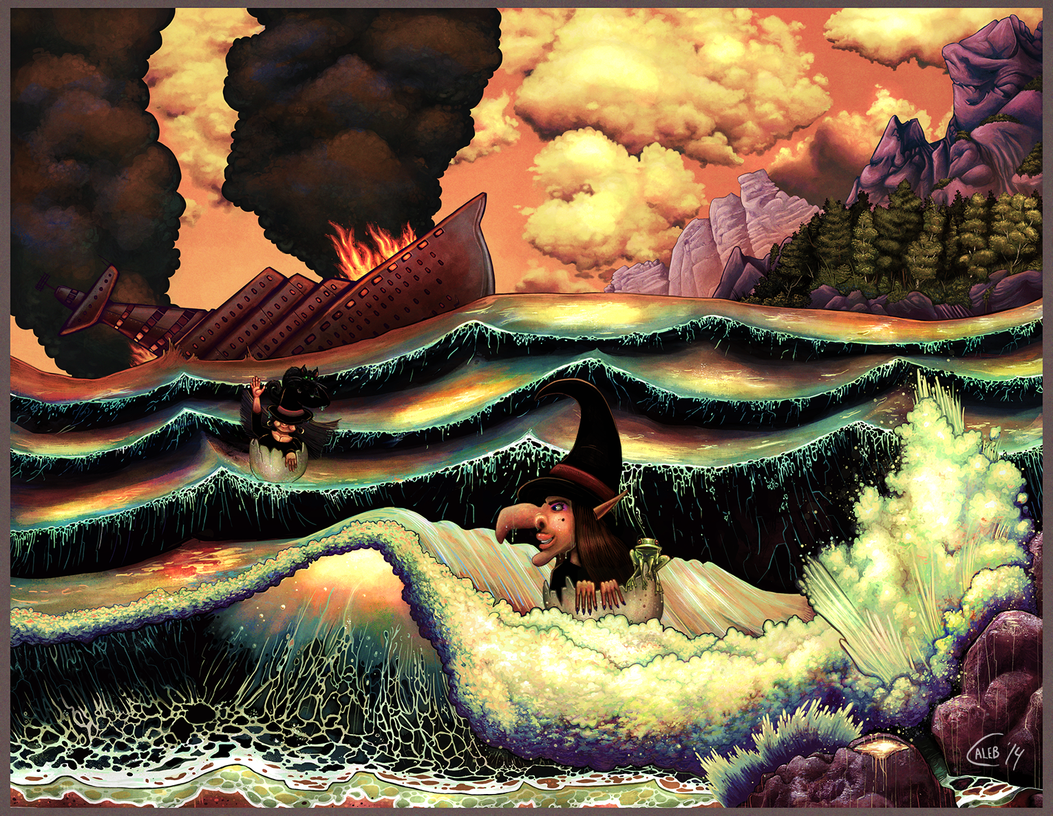
Hey There;
Just something I did for fun recently, based on an old superstition a lot of folks here still follow- i don't necessarily think we believe it, just one of those things that your moms moms moms mom did.
It actually was much more tame until I was watching random tutorials and the guy went into colour theory and started throwing around things like "NEVER" and "ALWAYS". Maybe I'm just an oddball but it sparked a random reaction where i broke as many of his rules as i could. I don't know if it was best for the image itself but it was a lot of fun to get out of my system. I guess its just a pet peeve when people try to make laws about art- Art has nothing to do about right or wrong. That's the only 'rule' you gotta follow :3
If you don't like where this went thou i have some more relaxing things coming up... Probably!
Submission Information
- Views:
- 405
- Comments:
- 10
- Favorites:
- 7
- Rating:
- General
- Category:
- Visual / Digital
Comments
-

-

Awww, why thank you so much <3 I'm not great at ships or witches yet... but colours have always come easy~
-
ahaha i can understand you there, but really I get so much pleasure just lookiing at this artwork, its like looking at a field of flowers, or looking off to a land of nothing but forest and greens, xwx i wish i could explain it better but its just very nice looking at this
-
I find that amazingly flattering since the average someone looks at artwork in general is like 17 seconds- if i manage to wisk folks away for more that's super, Especially with you making lovely work yourself :3 Love the brushstrokes.
-
-
-
-
This looks amazing to me! Being more than a little colour blind, I unfortunately can't enjoy the colour schemes used (I can see yellowish colours somewhat though, which there's a bit of in there so that's a plus!) but I don't think that detracts a lot from the artwork at all. It still manages to tell a slightly abstract story, & I love how you did the witches. Never seen eggshells used as flotation devices before--very clever & amusing!
-
I try to watch my values when i work, in theory images should be able to work just as well in greyscales if you want something solid- I admit i was not watching as carefully this time and the black of the sea tends to eat up the witches. I'm so glad you enjoyed it, and while we're yaking, thanks a bunch for the follow as well :3
-
-

WHOA that's fantastic! the first thing that grabbed me was the odd color combinations, instantly followed by the fascinating patterns of the crashing wave. and then the Cadbury crème-egg looking sunlight through the foremost wave, then my eyes followed along the gorgeous foam to the closer witch and as I was admiring her I saw that she and the other witch are both in eggshells! then there was the little volcano-esque tidepool, followed by the sun's reflection on all the troughs, and I moved up to see the dark rocky foothill that looks like the folds of a cloak and I almost thought it was a third witch or something because it almost has a smile and suggestion of a nostril. after that I loved the way the trees were so dense and at a slight angle on the shore, and how the rocky cliffs in the very back are sloping oddly into the ocean at the same angle as the sinking ship, and how the ocean seems to almost be a plane unto itself in relation to the ship and the shore.
I dunno person but maybe whoever you watched was using cunning reverse-psychology? amazing result in any case! now I'm off to see the rest of your galleryyyyyyyyy-
They COULD have been but I'm not sure~Mostly they had this odd rule where you could only use ONE saturated colour and the further you got away from it on the colour wheel the more desaturated it had to be... plus it was never like a super saturated colour he always picked mid value... unless he needed some blue electronics everything was sort of dreary. I don't mind limited palettes he just had such a hatred for too many "eye-numbing" colours at once.
Thank you very much for taking the time to share your thoughts; I love little details in my stuff, for sure :3
-
ha, I wonder how he'd have reacted to certain of grebij's palette choices!
it's funny that i had forgotten about this picture, having for some reason not favorited it even though i thought it was awesome, until i chanced upon it in someone's FA favorites. and even then i couldn't remember where I'd seen it before even though i remembered leaving a detailed comment on it till just a few minutes ago i saw your duplicate journal. it was a very happy rediscovery, certainly =')
-
Glad you managed to find it again! What a neat coincidence!
-
-
-
Link
Happysorry
Holy moly this is amazing alsjdoiwa My eyes just love the colors you chose. The vibrance and the boldness against each strand of color is just ammmaazing